11.29.2009

Revamp your cubicle for the holidays (Part III)

Obsession Christmas Decoration Trends Cubicle Moodboard

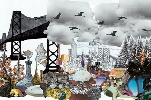
Here's a little inspiration based on the Obsession theme from the 2009 Christmas Decoration Trends. This theme is all about opulence and extravagance. It can be done in a relatively simple manner. For example, covering wall panels with a rich purple fabric would give the impression of being upholstered. It's a easy way to completely change the mood of the space. The Bougie table lamp also gives it an instant boost and would create a very nice contrast against the upholstered purple walls. The wingback chair from James Design UK would work nicely as well. It's a great combination of the old and the new.

01.Gold Glass Bird by Gisela Graham ornament, Heals
02.Gold Cone Bauble ornament, Heals
03. 18" Black Christmas Tree, Urban Outfitter
04. Purple Damasc fabric , C&M Textile
05. Satin Ball ornament, CB2
06. Gold Bourgie table lamp, DWR
07. Purple light strand, Urban Outfitter
08. Gem ornament, CB2
09. Hourglass, DWR
10.Wingback chair, James Design UK

11.24.2009

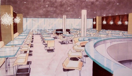
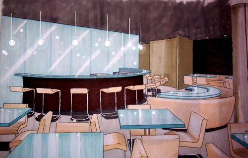
Restaurant design concept

Modern restaurant design concept bar M2JL STUDIO

I was going through some old files of mine and stumbled across an old project that I figured I'd share with you. The goal was to create a concept for a restaurant located in a trendy area of the city. I came up with a minimalist concept using simple natural materials (wood, glass, concrete). Above is the bar located in the back. The bottles were to be placed behind the glass wall and lit from the back to be the focal point of the restaurant. The bar top made out of glass could also be lit. You would be able to see it from the street at night. I was quite happy the round booth echoing the shape of the bar and the custom table to go with it.

Modern restaurant design concept general view M2JL STUDIO

I was really into cantilevered chairs and designed stools to match. The wall behind the booth along both wall were "bare" using zebra wood veneer. I was more interested in texture than doing anything graphic. I thought it was a nice back drop to the beautiful kou chandeliers.

11.22.2009

Revamp your cubicle for the holidays (Part II)

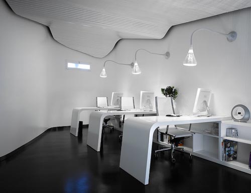
Modern white office

For Part 2 of the cubicle revamp based on the 2009 Christmas decorations trends, here are some items that would suit the Airy office space. This style goes very well with the minimalist space like the one above by M.MAS A Architect. Of course, not everyone is lucky enough to work in such space, but with simple adjustments, it's possible to get a similar feel with a holiday twist.

Airy Christmas Decoration Trends Cubicle Moodboard
01. Bottle brush trees, CB2
02. Anno Inez panel curtain, IKEA
03. Felt trees, CB2
04. Fasette candle holders, EQ3
05. Snow filled ornaments, CB2
06. Barcode flocked ornament, CB2
07. Mobile ornament, CB2
08. Disco ball ornament, CB2
09. Acrylic desk chair, Ruby Beets

I also found some great modern Christmas trees.

Aaron Thomas Christmas Tree Minimalist Acrylic modern lucite

The Aaron Thomas Christmas Tree takes very little visual space. It's a bit large for a cubicle but would look great in a common area of an office.

Modern acrylic Christmas treeModern white office

Modern acrylic Christmas Tree by The Modern Christmas Tree in nice and compact. It's perfect for a desk with very little distraction. The ornaments are already built in too.

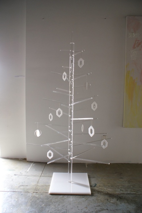
White Modern Christmas tree

I love this modern tree by Flickr member Two Little Pumpkins. I might try this one a home. A small version of this one with LED lights would fit nicely in a cubicle.

White Modern Christmas tree Pop Tree

The Pop Tree from Tongue and Groove is a neat eco friendly tree made out of water cut recycled plastic that resembles felt.

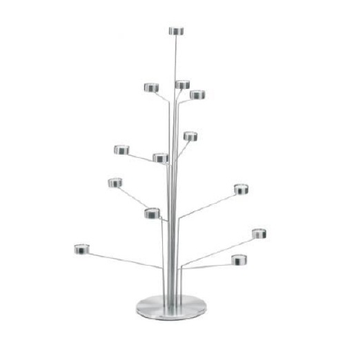
Modern white office

The tea tree light from blomus is very neat too. Perhaps the office is not the place to light candles but LED tea light candles would work.

11.20.2009

The outer space in your space

ORIGINAL POST DATE : 2008-03-20

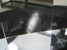
If, like me, you are fascinated by the beauty of the universe, you might fall in love with this beautiful piece of art by Living World, a small design office in Tokyo Japan.


source: Living World


Based on three-dimensional data from the National Astronomical Observatory of Japan, they were able to create an accurate representation of the Milky Way, our galaxy. So for the first time, we can actually see our galaxy in three dimensions. The Milky Way, suspended in a glass cube, is made of around 80,000 stars, created using laser etching techniques. Our star, the Sun, is placed directly at the center of the cube. I can’t help but wonder if the reason behind that decision is related to the fact that people used to believe Earth was at the center of the universe…This cube can be yours for 80,000 yen (one yen per star?) which is a bit over $800 CDN.

Can you imagine that out of these 80,000 stars one of them has our planet orbiting around it? Not to mention the fact that, the Milky Way, our galaxy, is only one out of billions of galaxies currently observable in the universe! It boggles my mind.


Galaxies, Photo by : NASA and The Hubble Heritage Team


Wouldn’t it be cool to also be able to get our solar system and various planets and moons suspended in a glass cube as well? Maybe that will be their next step. If so, perhaps I will have contributed by throwing the idea out there. If you see it, let me know!

11.17.2009

Revamp your cubicle for the holidays

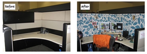
For those of you who spend most of your time in a depressing cubicle, the holidays can be an opportunity to bring some life into your work space. Blogger Diddly Squat transformed her cubicle by adding a couple clever accessories. And you can see how you can easily give a plain cubicle a bit more personality.

2009 Christmas trend cubicle decoration

So for the first series of Christmas decoration ideas, I was inspired to create a couple cubicle revamp moodboards based on the 2009 Christmas decoration trends, which might inspire you to do the same in your cubicle. First on the list of trends is the Comfort style.

2009 Christmas decoration trends

01. Anno Unni , IKEA
02. Frigg Tree ,Büro North
03. Rindd Tree ,Büro North
04. Gryder Tree ,Büro North
05. Sock Monkey, Sock Monkey.net
06. Birch Lamp set, Lekker
07. Simple Felt Basket, Design Withing Reach
08. Kotte Straw Goat, IKEA
09. Red petal flower ornament,holleymarie83 and Rönas Candlestick, IKEA
10. Tundra floor, IKEA

Stay tuned for more soon.

11.12.2009

Charcoal ...Eco friendly water purifier

Charcoal ...

"While this Coal Water Purifier (2006) appears black, it’s actually white charcoal, made from Japanese oak. The complex process for making white charcoal results in a hard glass-like material that’s clean to the touch (a small amount of residue is normal before its been washed) and naturally purifies water. Used in Asia for generations, Kishu Binchotan white charcoal absorbs chlorine, unpleasant tastes and odors while also infusing the water with natural minerals. Made in Japan."

http://www.dwr.com/product/accessories/kitchen/purify/binchotan-coal-water-purifier-large.do?sortby=ourPicks

space saving changing station from byBO design

modern wall mounted baby changing station by ByBo design

Bo Ekström, from byBO Design invented a modern baby changing station that takes up barely any space. It's perfect for small rooms. Called Nathi, this changing station is designed to be mounted on the wall. Nathi is made out of molded beech veneer and comes in two environmental friendly finish options : white lacquer and transparent whitewashed. There are shelves inside to tuck away any required items. This changing station currently retails for less than 600$ CDN and is rated for babies weighing less than 50 kg (110 lbs).
modern wall mounted baby changing station by ByBo design

11.09.2009

2009 Christmas decoration trends (Part 1)

2009 Christmas Decoration Trends Christmasworld exhibition

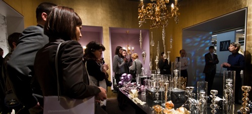
The holiday season is fast approaching and it's a great opportunity to transform your space into a fun and creative environment for yourself, your friends and family and perhaps your clients (if you own a storefront) to enjoy. Earlier this year, Christmasworld, an annual trade show in Frankfurt, Germany, said to be "the world’s leading trade fair for festive decorations" presents the trends and innovations for all festivities of the year, ranging from Christmas, New Year and St. Valentine’s Day to Easter, summer parties and Halloween.

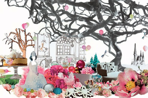
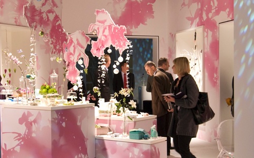
The 2009 Christmas decoration trends were developed by the style agency bora.herke and presented at the fair. They presented four main themes :

:: OBSESSION | Feminine elegance meets luxurious opulence
:: SWEET | Spontaneity, freshness and a happy-go-lucky nature
:: AIRY | A style that radiates modernity and lightness
:: COMFORT | The creative tension between the modern and the traditional.

2009 Christmas Decoration Trends Christmasworld exhibition Obsession

2009 Christmas Decoration Trends Christmasworld exhibition Obsession

2009 Christmas Decoration Trends Christmasworld exhibition Obsession


2009 Christmas Decoration Trends Christmasworld exhibition Obsession Sweet

2009 Christmas Decoration Trends Christmasworld exhibition Sweet

2009 Christmas Decoration Trends Christmasworld exhibition Sweet


2009 Christmas Decoration Trends Christmasworld exhibition Obsession Airy

2009 Christmas Decoration Trends Christmasworld exhibition Airy

2009 Christmas Decoration Trends Christmasworld exhibition Airy


2009 Christmas Decoration Trends Christmasworld exhibition Comfort

2009 Christmas Decoration Trends Christmasworld exhibition Comfort

2009 Christmas Decoration Trends Christmasworld exhibition Comfort

Over the course of the next couple weeks, I will be proposing various ideas on how to decorate your space for the holidays based on these themes for your table settings, your living room, guest bedroom, party room, gifts, etc. If there's anything in particular you'd like to see, don't hesitate to contact me by email or post a comment.

photos : Cosmoworld, Christmasworld

11.07.2009

How to turn a plain office building into a stunning hotel

Roomers Hotel Frankfurt building

Designer Oana Rosen along with the architectural firm,Grübel, did an amazing job when they took on the transformation of an abandoned office building into a stunning boutique hotel. Called Roomers, this gorgeous hotel located in the business district in Frankfurt, Germany certainly has a lot of style and a distinctive personality.

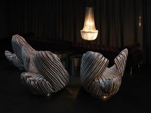
The lobby is just breathtaking with its mirrored reception counter, dark walls and sculptural seating shaped like a bird with its wings pointing up. There's a lot of contrast and texture in the room which makes it very interesting. Notice the mix of modern and traditional elements in the floor lamp.

Roomers Hotel Frankfurt lobby

Roomers Hotel Frankfurt lobby

Roomers Hotel Frankfurt lobby

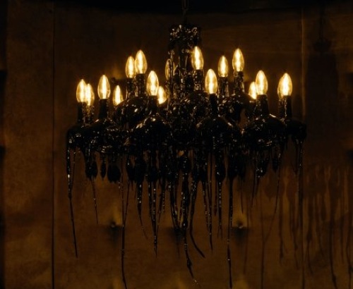
Roomer offers a 24h bar with large booths each with their own chandelier. The chandeliers have an interesting eerie feel to them and give the impression that they're melting. Notice the repetition of the round table reflected on the ceiling at the base of the chandelier. I also like how the designer arranged the lighting around the bar. It's a dark place perfect for intimate conversations.

Roomers Hotel Frankfurt bar

Roomers Hotel Frankfurt bar black chandelier

The restaurant is also dark and intimate. It has a very homey feel to it with it upholstered booths that look like giant sofas and lamps with lines similar to lamps that can be found in homes. Notice the consistency in the selection of the chair and the bar stools.

Roomers Hotel Frankfurt restaurant

Roomers Hotel Frankfurt restaurant

Roomers Hotel Frankfurt restaurant

Roomers Hotel Frankfurt restaurant

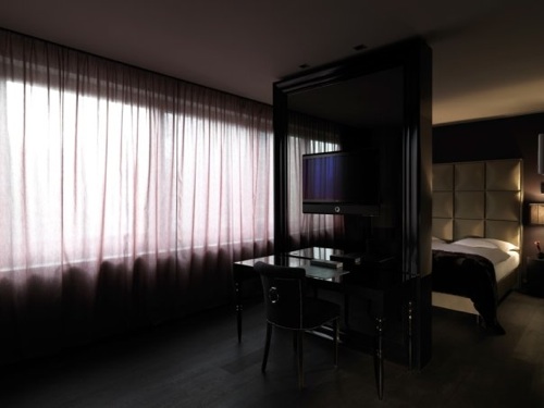
The design of the suites is simpler and less ornate but includes design elements similar to the rest of the hotel and provides continuity. For example, the headboard resembles the wall behind the reception desk and the colors are dark. The materials and colors evoke opulence but the lines evoke minimalism. It's an interesting mix. Notice the sink carved into the symbol of the hotel. This symbol can also be found on the door of the entrance, the screen of a fireplace in a lounge and the wall of what looks like the spa (shown below).

Roomers Hotel Frankfurt suite

Roomers Hotel Frankfurt suite

Roomers Hotel Frankfurt suite

Roomers Hotel Frankfurt suite

Roomers Hotel Frankfurt lounge

Roomers Hotel Frankfurt spa

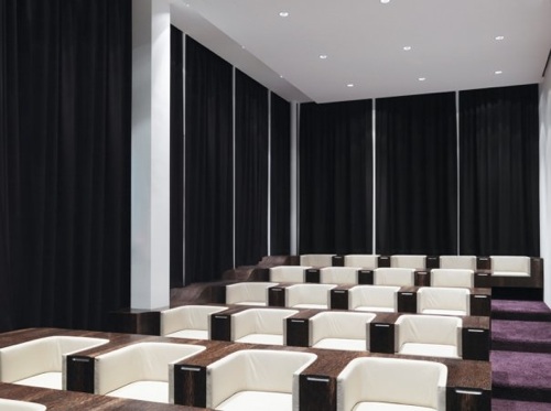
Another one of the hotel's stunning features is the conference rooms at the top of the building. It's "a 600-square-meter roof encased in an illuminated dome made of glass set in specially-glazed white concrete. Inside this futuristic bubble, three fully-equipped conference rooms offer spectacular views over Frankfurt’s banking district below and the river Main nearby." Can you imagine having a conference in rooms like these with floor to ceiling windows and a spectacular view of the city? I love the sunken chairs and how they disappear under the table.

Roomers Hotel Frankfurt conference room

Roomers Hotel Frankfurt conference room

Roomers Hotel Frankfurt conference room

You can see more pictures on the Roomers facebook page or check out this video (german).


photos : Roomers