7.27.2009

Party at My House


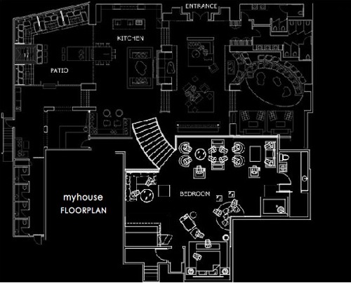
While reading some of my favorite design blogs,Contemporist, I came across this really interesting design for a nightclub in LA called My House . The idea behind this design from Dodd Mitchell was essentially to recreate a house party atmosphere in a nightclub. This nightclub has all the basic rooms a house would have (living room, kitchen, patio, bathroom and bedroom) but in a much larger scale, as shown in the plan below.


One thing I really like about this club is that there is plenty of seating! There's nothing that annoys me more than to go to a club where the only place to sit is in the VIP section. I think the design really works. It looks like a house and as comfortable as a house, but the dark color palette works well for a nightclub. I love the kitchen and the fireplace on the counter with the purple glass. It looks like a very fun place to entertain friends.


photos: Contemporist, My House Hollywood


become a fan of M2JL :: STUDIO on Facebook

7.21.2009

Get that look! Modern Office space


Music videos can be very good sources of inspiration if you are looking for ideas. I've always loved to watch music videos and often find myself analyzing them for their design. Here's an example of a nice office from Ne-Yo's video for Miss Independent.

video


The storage area is located behind the desk. It can easily be reproduced with Ikea items and some hacking skills. The open wall unit in the video looks like an Expedit bookcase on its side. The Expedit bookcase is flanked by a tall Billy bookcase on the right and supported by a modified version of a short Billy bookcase on the left. The tall Billy bookcase would have frosted glass doors (Billy Morebo). It looks like there is a small work surface as well. Provided that the length is correct, a sofa table like the Expedit Sofa Bench could be installed under the Expedit bookcase. Similar red and silver accessories can easily be found in stores like Ikea, EQ3 or Pier1.
moodboard Miss Independent Ne-Yo

video


I found a black globe similar to that of the video at Design Within Reach and a similar floor lamps (JONISK) at Ikea. The black desk could be custom made and pictures of the city can also be found at Ikea.
moodboard Miss Independent Ne-Yo

video


I love the white leather desk chair! It looks like the Steelcase' Leap Worklounge. The clock on the wall is a classic : Nelson ball clock. The spun floor lamp is also available at Design Within Reach.
moodboard Miss Independent Ne-Yo


With these elements you can definitely recreate the office of Ne-Yo's video. All you need after that is a silver paint color on the walls and a dark gray floor...I'm thinking concrete as opposed to a commercial carpet.

7.16.2009

Tres Cuatro Cinco mailboxes


While on vacation in Ibiza, I came across this really cool mailbox system in a modern condo. I looks like a wooden bench with filing boxes sitting on top. It's simple yet original.

Modern mailbox Ibiza

Modern mailbox Ibiza


Originally designed by LluĂ­s Clotet and Oscar Tusquets in 1975 it was called A Sardinel mailboxes and evolved into Tres Cuatro Cinco (three four five). Designed to be tall, narrow and deep it offers more capacity than traditional mailboxes, without taking up too much visual space.

Tres Quatro Cinco Mailboxes

Tres Quatro Cinco Mailboxes
photos : Barcelona Design

It would be nice to see more original mailboxes in condos and apartments like these around here. And for a bit more color, the Mailbox Mail Me designed by Fabrica would also be very interesting.

Tres Quatro Cinco Mailboxes
photos : Barcelona Design

7.08.2009

Eating area for two


So there has been a bit of progress in the little eating area. I've added two beautiful Tobias chairs and a cool KNAPPA pendant lamp, both from IKEA. I've been eyeing these items for a while. I was also looking at the MONACO Large Pendant Lamp from EQ3, but it requires "hardwire" installation, which is not possible in a rental. I don't like seeing the cord hanging so I ran the cord on the ceiling towards the corner of the wall and attached it with an IKEA kit. Turned out pretty good, you can barely see the cord down the wall.

M2JL :: STUDIO project IKEA KNAPPA lamp Tobia chair


Since there wasn't a lot of space, I decided to use transparent chairs in order to take less visual space. The lamp adds a great contrast against the wall. The shape is reminiscent of water lily.

M2JL :: STUDIO project IKEA KNAPPA lamp

It was an interesting lamp to put together. When I opened the box, I was a bit taken back by all the pieces. But it was easy and quick to put together. I'm always impressed at the way IKEA manages to minimize its packaging and the ingenuity it took to come up with a way to break down their items as much as possible and still make it easy for people to put together. And if I'm not mistaken, the parts are recyclable!

M2JL :: STUDIO project IKEA KNAPPA lamp

M2JL :: STUDIO project IKEA KNAPPA lamp


The next step is the table. I've spotted a really nice one at Zone Maison. I thinks it's called the bar table - Lily. The one that I saw (at the store) looks very similar and it can go up or down. Ideally I'd like for it to go down from coffee table height up to table height, so that it would have a dual purpose. Again, the use of glass reduces the visual weight of the furniture and doesn't take too much space and the highly reflective surface increases the amount of lighting in this area.

M2JL :: STUDIO project Zone Maison Round glass table

7.06.2009

Modern hospital in Ibiza


During one of my many walks in Ibiza town, I noticed this great looking public building. I was surprised when I realized that it was actually a hospital: Centre Salut Vila. It looks nothing like the typical depressing institutionalized hospitals I'm used to seeing. This one looks good: simple, modern, minimalist. I actually peeked inside (sorry no pictures from inside, I didn't feel it was respectful to the patients inside), the indoor space was really nice as well. It had a very open and airy feel and there was a lot of natural light coming inside the building, partially due to a little indoor courtyard. I imagine it's much better to work in a hospital like this one than the typical old, stuffy and dark hospitals. I think good design and integration of natural light and plants help patients feel better faster in a hospital.

Modern architecture hospital Ibiza

Modern architecture hospital Ibiza

Modern architecture hospital Ibiza


The two large openings in the following picture are for the ambulances to come in. The garage seems to have been designed in such a way that the passerby can't see too much of the "action" as ambulances arrive to the hospital, which is a great idea.

Modern architecture hospital Ibiza


I love the way the windows and garage entrance were designed. They look like they were carved out of the building.

Modern architecture hospital Ibiza