9.27.2009

NatureMill Easy Composter

ORIGINAL POST DATE : 2008-10-07

It's great to see that the majority of people recycle nowadays. Even malls such as the Eaton Center have recycling stations in their food court but also in other locations throughout the building. There are more and more recycling stations on the streets of Montreal and I would imagine this helps reduce the amount of waste in the landfill. Which makes me believe that it's time to get to the next step : composting.

Thanks to companies such as NatureMill, composters are now more user friendly. The ones carried by NatureMill are said to be automatic and odor free. The can be left indoor or outdoor and turn food into compost in only 2 weeks. They also come in a variety of colors (PRO Edition).


NatureMill Composter
Source : NatureMill

Everything is done automatically. All you have to do is add the food and take out the compost every 2 weeks.

NatureMill Composter NatureMill Composter
source: NatureMill

The PRO Edition can even be used in small offices and restaurants! I wonder if restaurants use composters. If not, I think they should and maybe even pair up with landscape companies so that all that organic compost can actually be used.

NatureMill Composter NatureMill Composter
source: NatureMill

The composters can be purchased directly from NatureMill or in places such as Home Depot for $329 for the PLUS Edition and $399 for the PRO Edition.

9.21.2009

Pink and Orange Room for a little girl

Some of my clients are great DIYers. For their projects, my work consists of coming up with a great design concept for them to execute. Even if I'm always available to guide them through, they make the final decision, so it's always a nice surprise to see the final results because inevitably they will add their own touch to the design. Here's an example from a couple who was redoing their little girl's room because she was finally ready to trade her crib for her first bed.

Originally the space was dark and not very feminine. The parents wanted a room that better suited her personality.

M2JL :: STUDIO bedroom makeover

Apart from the items that had to stay in the room (mostly the pink furniture), my color scheme came from this really cute stuffed giraffe that was in her room.

M2JL :: STUDIO bedroom makeover

As you can see, paint makes a huge difference in the look and feel of a room. For her room, I proposed to change the color of the walls to brighten the space, and go bold on the ceiling to add personality and warmth. The walls were painted white and the ceiling fuchsia. This solution gave a very nice pink glow to the room without having to paint the walls pink. I had to consider the fact that a lot of the existing pink furniture was staying in the room, so pink walls would have been too much.

M2JL :: STUDIO bedroom makeover

I also proposed to use a wall adhesive above the bed. I love the one they finally chose to put over the bed. I also love the customization of the curtains, where pink and orange butterflies were added on the sheer curtain. These clients really took the concept and ran with it. Apparently the little girl loves to stare at the ceiling. They did a great job.

M2JL :: STUDIO bedroom makeover

M2JL :: STUDIO bedroom makeover

9.15.2009

Spacewalker lights by Constantin Wortmann

I'm one of those who believe that a light fixture can also be used as a piece of art and add personality to a space. This is definitely the case for Spacewalker, an innovative and fun light fixture designed by Constantin Wortmann of Büro für Form for DARK.

Spacewalker resembles a 3D stick figure with an enormous head. It currently comes as a pendant light upside down or a giant floor light standing upright. I like the red cord detail. To me it gives it more life, almost like a blood transfusion tube. I imagine a table version of this lamp might eventually emerge. I think these lamps would be a nice addition in a club, a boutique hotel or a great loft.

Spacewalker light by Constantin Wortman for DARK

Spacewalker light by Constantin Wortman for DARK

Spacewalker light by Constantin Wortman for DARK

Spacewalker light by Constantin Wortman for DARK

Spacewalker light by Constantin Wortman for DARK

Spacewalker light by Constantin Wortman for DARK

Spacewalker light by Constantin Wortman for DARK

Spacewalker light by Constantin Wortman for DARK

Spacewalker light by Constantin Wortman for DARK
source: Büro für Form,DARK.

9.10.2009

Good looking radiators

ORIGINAL POST DATE : 2008-09-03

Yes, radiators can be beautiful. The trick is to look towards Europe at companies such as Stylish Radiators LTD from the UK who carry a line of radiators called Rad Art which not only heat the rooms but also serve as art pieces as shown here.

Rad Art Radiator
Rad Art Radiator
Rad Art Radiator
source: Stylish Radiators Ltd


Hopefully the trend will migrate to Canada and replace the bulky traditional radiators that seem to dominate older homes.

Typical radiator

9.07.2009

Who knew McDonalds could look so good

Not that I'm a huge fan of McDonalds, but I admire the fact that it is a company that's not afraid of changing, adapting, evolving and moving towards the future. Soon after the Supersize Me movie, it started to offer healthier alternatives and was the first to indicate the nutrition value of all their meals and some branches are now recycling as well. In Europe, interiors of the McDonald chains are moving to the modern side. Shh an architectural, design and branding company in the UK created three modern McDonalds restaurants in the UK : a flagship store on Oxford street, an outlet in the Chapelfield shopping center in Norwich and another one in West Thurrock.

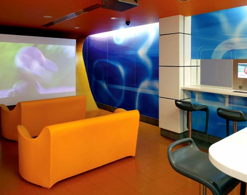
Flagship Restaurant in Oxford
The flagship restaurant located on Oxford street includes a teenage 'bar' dining area, TV screens, internet and gaming points. It makes sense considering the fact that in an urban location, teenagers are more likely to go there. If only the one in the Byward Market (Ottawa) could look like this (*sigh*). There are beautiful glass stairs leading to the second floor. I love the way they integrated the colors of McDonalds (yellow and red) in a modern way. I imagine it's a nice hang out spot for teenagers if they don't over do it.
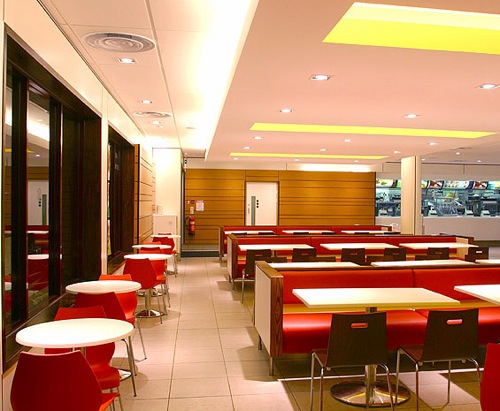
Modern McDonald designed by Shh

Modern McDonald designed by Shh

Modern McDonald designed by Shh

Modern McDonald designed by Shh

Modern McDonald designed by Shh


Norwich outlet
In Norwich, the design of the flagship restaurant was adapted for a mall. I think they did a really good job. Instead of the typical square counter they made it round and bright white so the red and yellow really stand out. I love the red tiled wall in behind the booth and the large white u-shaped counter. It looks like an ideal place for kids. The booths on the other side of the red glass panels are a bit off to me. I love their shape and the idea, but I don't get the color (a bit old compared to the rest of the space). Perhaps it has to do with the mall rather than the McDonalds.

Modern McDonald designed by Shh

Modern McDonald designed by Shh

Modern McDonald designed by Shh

Modern McDonald designed by Shh

Modern McDonald designed by Shh


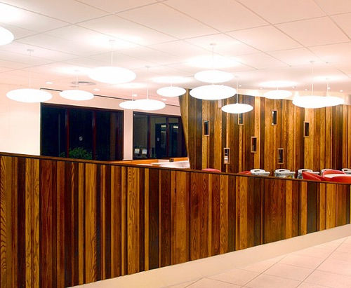
West Thurrock outlet
For the West Thurrock restaurant, a freestanding drive-though restaurant, they went on a slightly different direction using accents of wood and a bit of orange (mixing the yellow and red from the brand's color... smart!). This space is a bit more serious. Apparently very popular with families, it includes an "optomusic pod", an interactive kids' game zone and internet stations. I love the pendant lights randomly placed above the seating area. Notice how the height of the booth increases at it gets closer to the area where people can order their food to give them more privacy (clever). The long red benches look like sofas, which make them inviting for groups. You can see why families would be inclined to come eat there. I love the lines they create in the space. Notice how even the shade of the chosen wood veneer match the McDonald colors: mixing the signature red and yellow to get that orange tint. The chairs use in this space evoke classic mid-century modern chairs such as the Ant Chair, Eames rocker.

Modern McDonald designed by Shh

Modern McDonald designed by Shh

Modern McDonald designed by Shh

Modern McDonald designed by Shh

Modern McDonald designed by Shh


I really hope fast food chains around here open up to modern design. Because what we get so far looks more like this :(

Typical McDonald Restaurant in Canada

Typical McDonald Restaurant in Canada


Modern design shouldn't only be for expensive restaurants. Right?

source: designdeinteriores, shh

9.01.2009

Triflow tap by Zaha Hadid

I love this biomorphic faucet by architect Zaha Hadid from Triflow Concepts's designer collection. It looks nothing like the typical faucet we see in most houses. This design was inspired by the fluid movement of water and it is seamless. It is also innovative because it includes a three-way system that allows filtered water to be delivered on a separate conduit. The hot and cold water is controlled by the handle and the filtered water is activated by a touch-sensitive electric button, the Triflow logo. A green light comes on when it's operational and the light turns red when the water treatment cartridge needs to be replaced. A red flashing light indicates that the battery (used in case of a power failure) is running low.

Triflow tap by Saha Hadid

Triflow tap by Saha Hadid

There's currently a faucet for the kitchen and another one for the bathroom. The bathroom faucet has a much lower profile than the kitchen faucet.

Triflow tap by Saha HadidTriflow tap by Saha Hadid

Triflow Concepts is currently running a competition for the next innovative tap or accessory. So if you have a great idea, here's your chance to turn your concept into reality. The winning design will be taken in production and Zaha Hadid will chair a panel of judges that will choose the winner. The deadline for the application is September 7, 2009. Check out their website for more information.

Triflow tap by Saha Hadid

photos: Mocoloco & Triflow Concepts