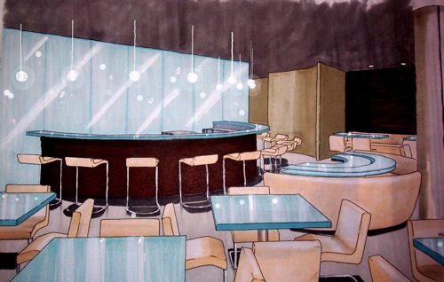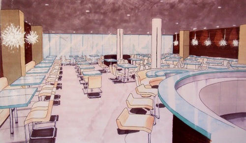
I was going through some old files of mine and stumbled across an old project that I figured I'd share with you. The goal was to create a concept for a restaurant located in a trendy area of the city. I came up with a minimalist concept using simple natural materials (wood, glass, concrete). Above is the bar located in the back. The bottles were to be placed behind the glass wall and lit from the back to be the focal point of the restaurant. The bar top made out of glass could also be lit. You would be able to see it from the street at night. I was quite happy the round booth echoing the shape of the bar and the custom table to go with it. 
I was really into cantilevered chairs and designed stools to match. The wall behind the booth along both wall were "bare" using zebra wood veneer. I was more interested in texture than doing anything graphic. I thought it was a nice back drop to the beautiful kou chandeliers.

These are lovely renderings; very cool to see. I like the ides of the wood veneer on those walls. :0)
ReplyDeleteThanks :)
ReplyDelete