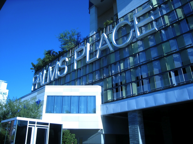
While in Las Vegas, we stayed at the Palms Place, an awesome design hotel minutes from the strip. This is the same hotel where MTV shot The Real World Las Vegas and the 3000 sq ft Real World Suite can be rented as well. I'm a big fan of design hotels. Ever since my first experience at the Germain in Toronto (more of a boutique hotel as it's a lot smaller), I was hooked. (I'll probably write about it at some point). Anyway, The Palms did not disappoint. Here's a little tour from my point view.
My first impression : "OMG This place is HUGE!". I believe there are 58 stories at The Palms Place and it's connected to the casino and two other towers where you'll find the regular hotel. Still, despite its size, The Palms felt welcoming and cozy.
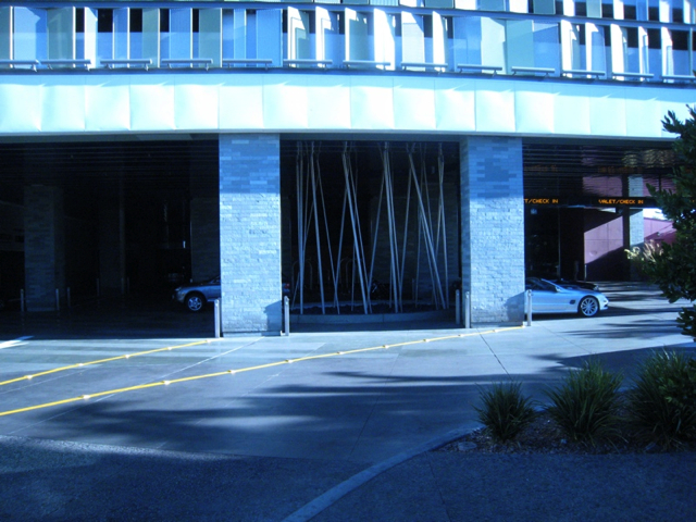
When we arrived we were welcomed by palm trees lining up a small path leading to the entrance. It was so hot in Las Vegas while we were there (between 38 and 43 degrees Celcius!) and there were no clouds, just a big ball of fire in the sky. Coming from Canada, we definitely felt the difference. But we got used to it relatively fast, and now we miss it. It was interesting to notice the subtle architectural features designed to protect people from the sun. For example the porch was huge. It was also very well organized for taxis and cars to come in, with a space for cars to temporarily park in the shade.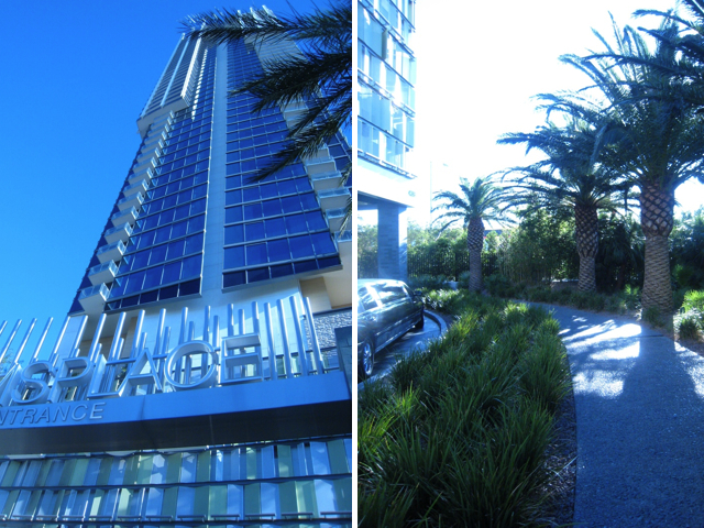
Just to give you a better understanding of the size of this place, you can see in the photo of the floor plan below where our hotel was located. Our hotel was connected by the Skytube (orange line going from the centre of the Palms Place to the left) to a larger building including a 14-theatre-3,500-seats-movieplex, a very large casino, a food court, several nightclubs, several restaurants, a shop and a pool.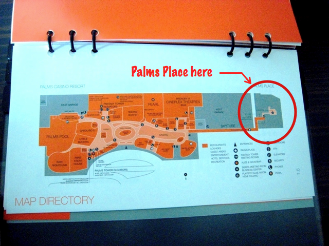
The lobby was very nice, with very high ceiling (maybe 20 ft high) and nice covering on the wall. Even though it was large, it did not feel cold or commercial. I think it's probably due to the warm color palette including warm browns, gold and bright yellow hues and the clever layout.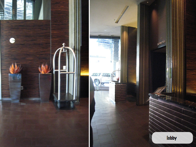
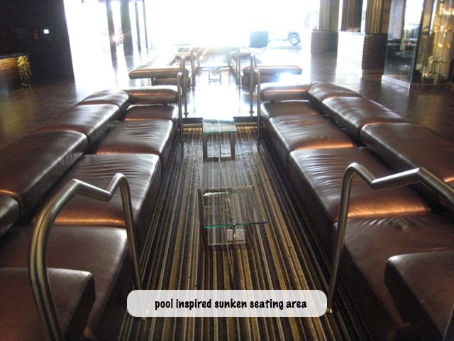
I really like the sunken sitting areas, reminiscent of a pool, specially the handle bars leading people inside the sunken area.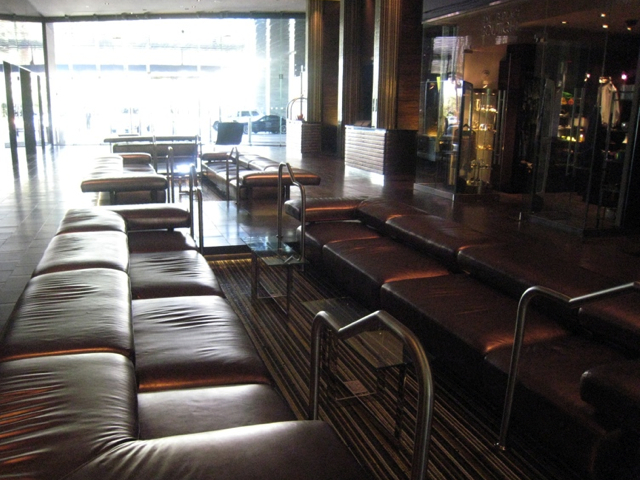
The corridors in the hotel were dark and covered with a neat texture laminate which made the space nice a quiet. I love the wall sconces: Very modern and minimalist. They created a nice ambiance.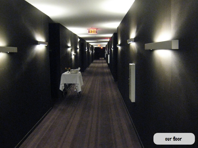
I noticed a lot of neat design features too. For example, there was a set of doors leading to our suite and our neighbor's suite. A bit like a private lobby. I imagine this means that if you come with a group, you can "join" the two and have your own little lobby within the main corridor. Another neat feature was the "do not disturb" and "house keeping" buttons inside the suite. They were connected to a doorbell outside the unit in the mini lobby (there was another from the corridor as well). The doorbell had a light that would turn green if you wanted house keeping and red if you did not want to be disturbed. It surely beats having to call the front desk for housekeeping leaving after the "do not disturb" door sign on the handle like in other hotels.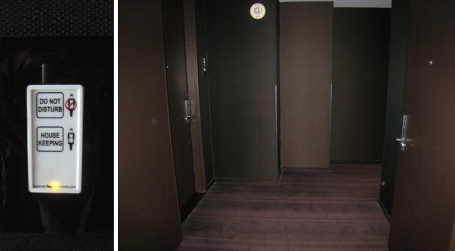
There's a lot of choices, when it comes to the type of accommodation you would like. We choose the Studio, which is the smallest one, as we were only two and didn't need more space. The studio is basically a 600 sf. ft. luxury condo. Below is a picture from the hotel's website, which is what we expected and pretty much what we got. We also asked to have a room with a view of the strip.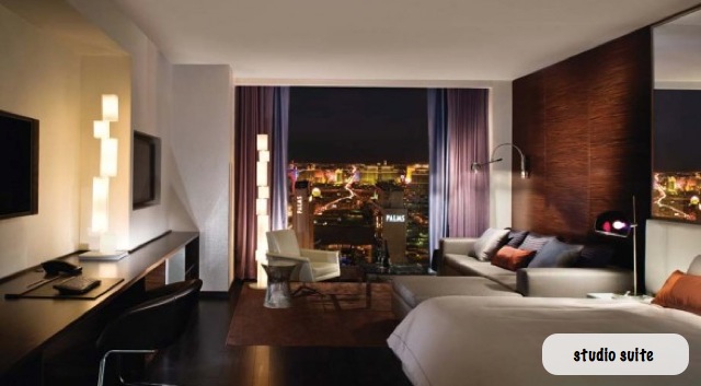
What a view! The only downer is that we didn't have access to the balcony. It seemed to be a touchy subject when we asked the front desk, so we didn't pursue this more.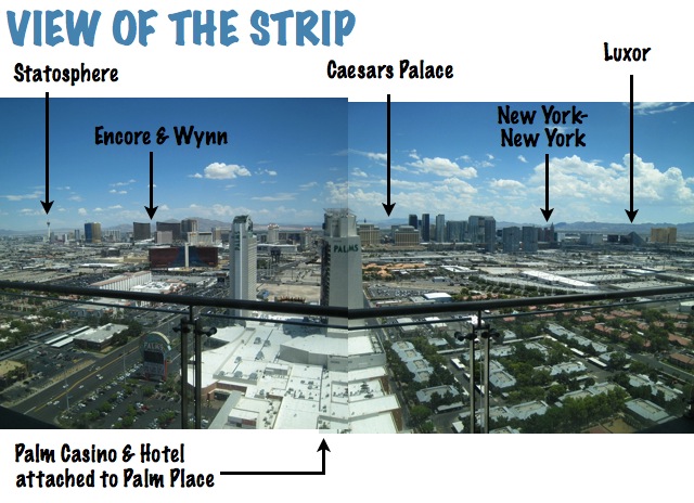
And this was our room.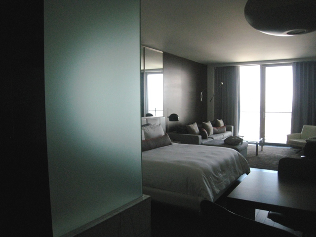
The room can accommodate 2 to 4 people at a time. It includes a bed and a hide-a-bed in the sectional. The floors were dark hardwood with a carpet inlay in the living area. There were two sets of blinds (a sheer and a blackout), lots of seating options, three TVs (now I really like the idea of having a TV in the bathroom), a walk-in shower and jacuzzi tub, with a frosted glass wall between the tub and the bedroom (shown above).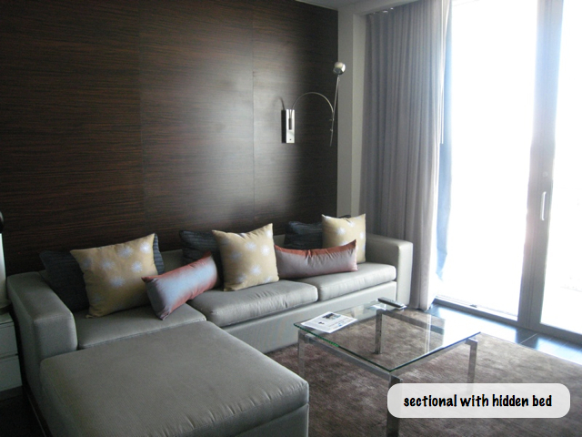
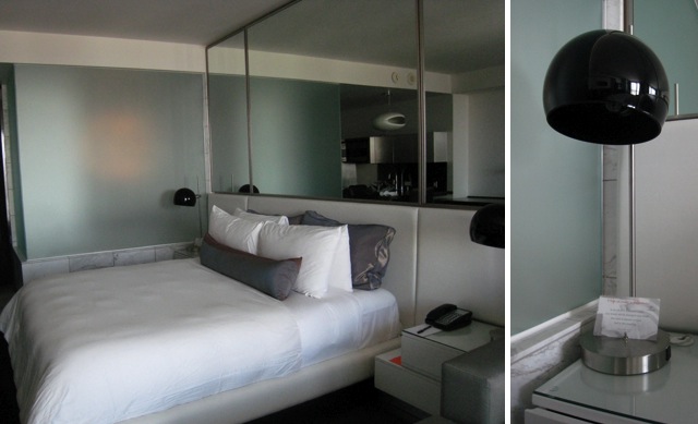
The bed was very comfortable, nice and crisp. There was also a lot of storage available too: Two wardrobes, two night tables and a storage low large unit facing the bed and sectional.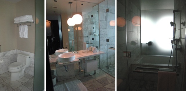
There was marble almost everywhere in the washroom. I also like how the bath was tucked in behind the walk-in shower and far away from the toilet. (Having the bathtub right next to the toilet is one of my pet peeves. How relaxing and luxurious can a bath really be with a view of the toilet?)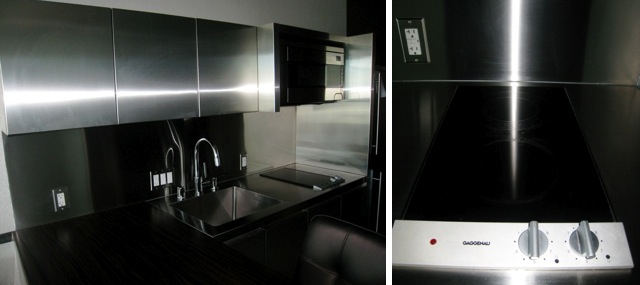
There was also a very neat kitchenette at the entrance with Gaggenau stove top! Everything was in stainless steel (easy to clean and keep clean). The kitchenette was a very well equipped with the stove top, a microwave, a sink, a dishwasher, a fridge with an ice maker, dishes, dish soap,etc. You could easily make this your home if you wanted too!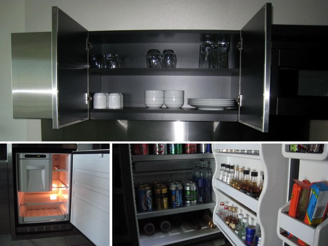
Another neat feature was the sliding counter hiding the dishwasher. The light fixtures were fun too, specially the one on the table.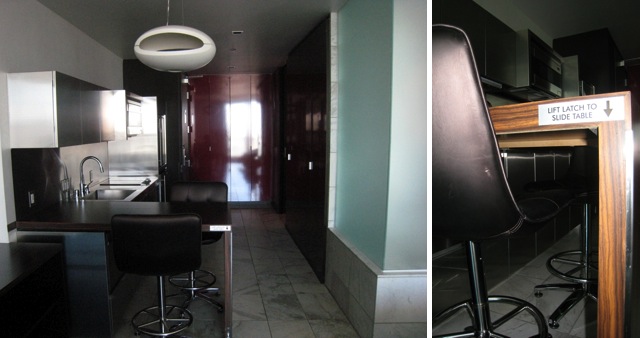
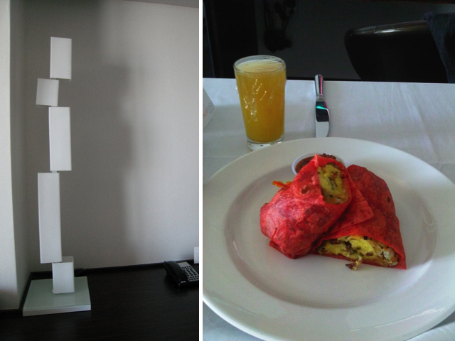
We didn't cook. There's just too many great restaurants to try. We had room service for breakfast once. It was very good, but we forgot how portions are much bigger in the US. We ordered a breakfast burrito each but we should have just shared one. I'll keep that in mind for next time :)
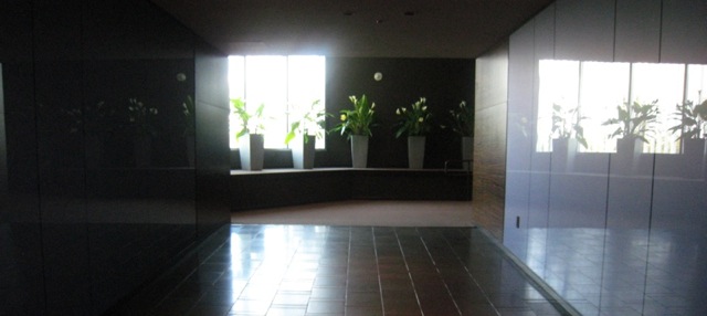
As far as the amenities, there's a common area on the 6th floor, where you'll find Simon Restaurant Lounge curated by celebrity chef Kerry Simon, a spa, and an outdoor pool. Below is the 6th floor lobby. Notice the walls are brighter as this is more of a public area. I also love the lighting in the wall.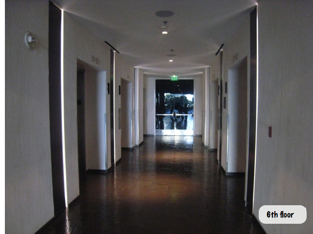
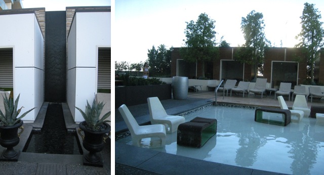
The outdoor space was really nice as well, with cabanas, a shallow pool and a regular pool in the back. The restaurant had a view of the pool too and there was a really neat water fall between two of the cabanas at the entrance. It was very serene. There was also an outdoor bar.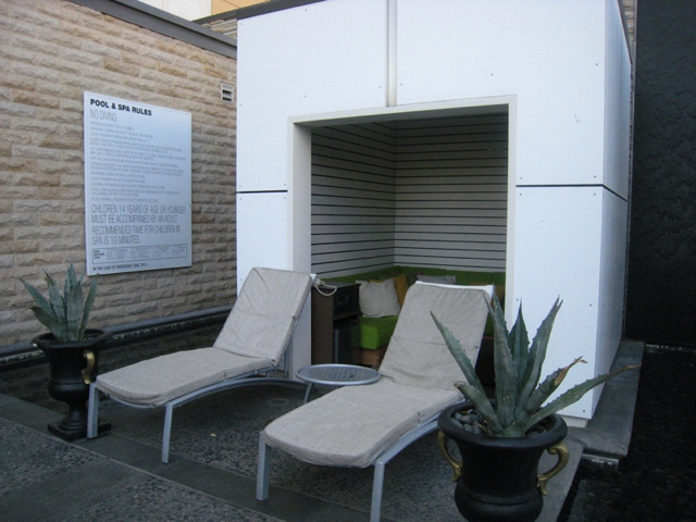
We went to Simon a couple times during our stay. It was a feast for the eyes as well as the stomach. There was a lot of neat textured materials used in the space that fitted nicely together.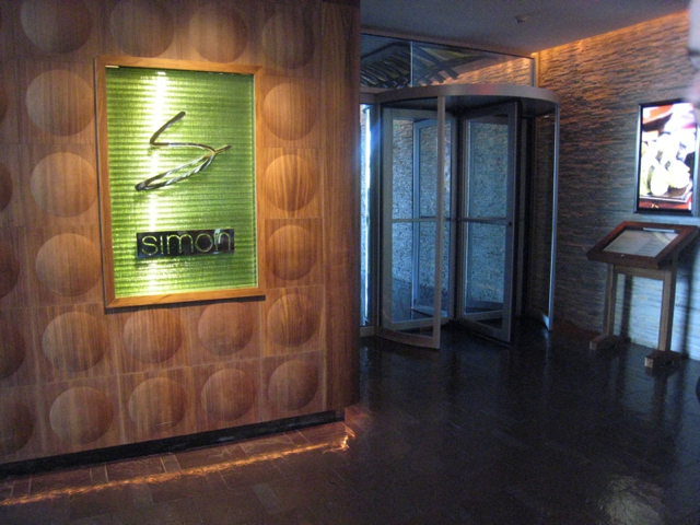

The food was excellent. I highly recommend it. Hopefully we'll get a chance to come back.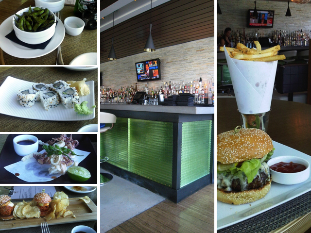

So this concludes a tour of the first part of The Palms. Stay tuned for part 2, where I'll take you on a tour on the other side through the Sky Tube, which connects The Palms Place to the Casino and other portions of the hotel.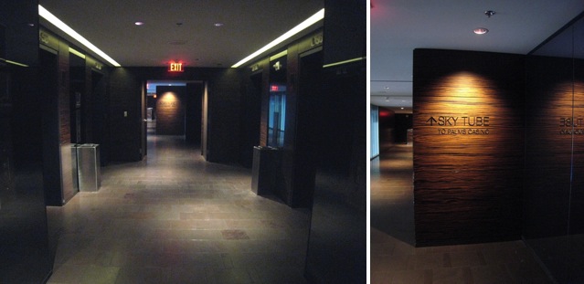
Photos : M2JL STUDIO | Palms Place | Haute Dining |

No comments:
Post a Comment