

I'm almost done with one of my kitchen projects where I was asked to help my clients modernize their small kitchen and make it more functional, without getting into major renovations. Below is what the space looked like originally.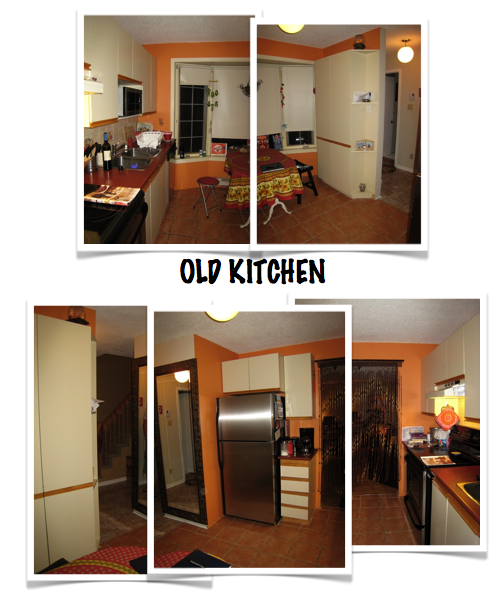
As you can see from the "before" picture, one of the main challenges was that three of the four walls had limitations : two of the walls had openings and another one had a large bay window that was about 30 inches from the floor. So there wasn't a lot of space to add counters using the original layout.
The plan view of the original space also shows that the 13-inch deep pantry was covering a portion of the window. We also didn't have enough space to push the wall back and allow for more counter space. Quite the challenge!
The solution was to close one of the openings which wasn't really needed, widen the opening facing the window to bring more natural light and use the added wall space for more counters and cabinets. We rotated the fridge and transformed the L-shape kitchen into a corridor kitchen. This way we were able to increase the square footage of the workspace by adding 12 inches deep cabinets with counters on either side of the fridge. 
I love this kitchen. It's not often that homeowners ask for a bright red kitchen cabinets. We we went for IKEA's Abstrakt high gloss red cabinet with white quartz countertops. Here's a sneak peek of the space. Almost done :) Stay tuned for the results and more details on the finishes. 
Oh that looks fantastic! I'm looking forward to seeing the final pictures!
ReplyDelete