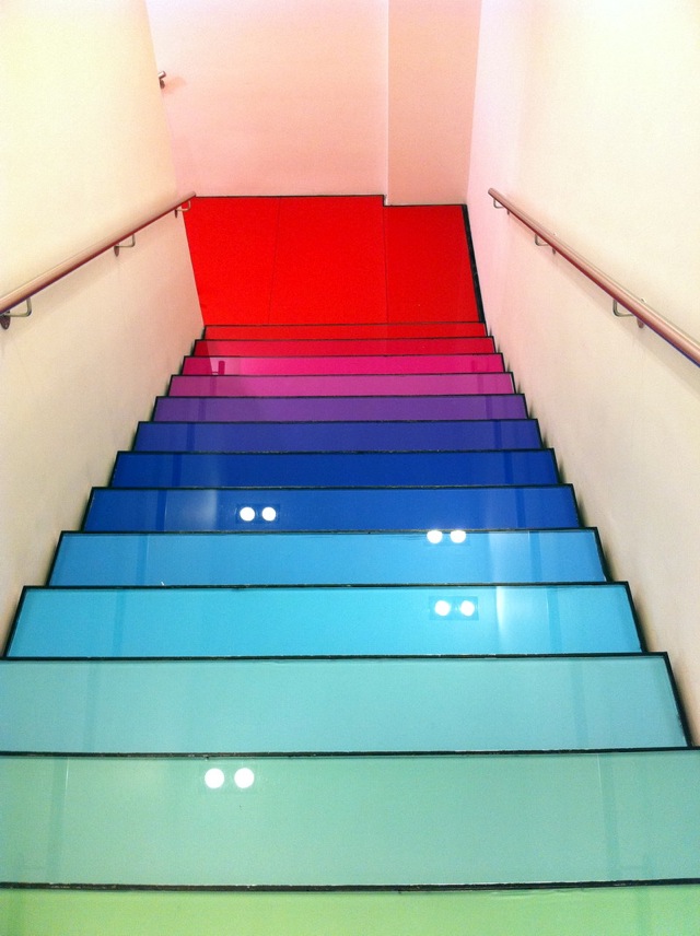
The beautiful stairs shown above (source : Dwell) are the work of a design firm called Ab Rogers in London for a home called the Rainbow House. The colorful stairs in the middle of a bright white space, are more inviting, fun, and still modern.
It seems to me like staircases in large condominium buildings are the most forgotten space when it comes to design. They very often look like a commercial space, even though they are supposed to be part of a home. Taking the stairs in a condo or apartment building is much healthier than taking the elevator, but they are so uninviting, that most people prefer to take the elevator. They tend to become neglected to over time. I think if we would take the time to make them look more interesting, more people would take the stairs more often.

Take a look at these stairs from a condo in downtown Ottawa. The concrete walls are painted white and the railings are charcoal. It's a little depressing don't you think?

If it was up to me, or if I was a member of the condo board, I would suggest to add a bit of color. I think the walls would have to stay white to maximize the reflection of the artificial light in the space (it's an energy saving strategy). However, the railing could be painted in different hues as shown below (source: House to Home). And why not add a colorful art piece on the wall of each landing with the floor number?

Another great alternative would be to paint the floor a bright color like the stairs from the Benetton store at Oxford Circus (Source : Zamir's Big Fat Blog). Look at the hues of these stairs. Aren't they more inviting ? The only thing I would change in this picture are the handrails. I don't think they are the best option considering the floor, but to each their own.


No comments:
Post a Comment