Showing posts with label makeover. Show all posts

1.19.2013

MODEL HOME REDESIGN - Part 6


We're now on the main floor of the Fusion project, in the powder room. The powder room is a place where you can be a little bold when it comes to decor, as it's a small and confined space that is somewhat separate from the rest. So I went for something a little more dramatic for this room while using the same basic color scheme. 


I didn't want to clutter this small space, so instead of adding art frames on the wall, I made the walls the art pieces. I found a really nice tile that reminded me of a waterfall when installed vertically and had them installed on the largest wall. I wanted to also add river rocks along of the walls, but because of the way some visitors let their kids loose in model home, it was too risky. The river rocks might have ended up in different parts of the house. So I opted for a neat wallpaper with a river rocks pattern to go behind the pedestal sink instead. 

There's not a lot of space to add decorative items in a space like this. So I didn't use a lot of accessories. Just two green plants to add a bit of color and life. 


1.17.2013

MODEL HOME REDESIGN - Part 5

For the second bedroom, I imagined the occupant would be a teenager (boy or girl) and decided to make this room a little more bold. As you can see I used the exact same furniture as in the previous model home, but completely changed the color scheme. I'm happy I was able to find another bedspread within budget, because it would have been harder to integrate the previous one in a new scheme. 
One major decor element was to have stripes painted on the wall and the ceiling. Not sure if the painters were too happy with this, but I love the impact it has as you enter the room. It gives it more energy. I also found a couple interesting accessories. I really like the table light with a glass base that I found on sale at Winners. It was perfect to for the little elephants I placed inside. 

On the other side,  I wanted to add something interesting and simple and decided to go with wall stickers from Blik of the Dancers illustrations by Keith Haring. They're fun and are perfect for a teen's room without being gender specific. 

1.15.2013

MODEL HOME REDESIGN - Part 4

One of the bedrooms had to be furnished as an office, so I decided to use the room next to the bathroom.  All the furniture, except for the two orange chairs were repurposed from previous model homes. 
It's interesting how things develop during the decorating stage of a project : it's part planning and part scavenger hunt and part luck. For the office, it started with the Solmyra frames from IKEA. I really liked them and I decided to add them to the decor during the planning phase. I figured they would have a great visual impact as they would be the first thing you see when you enter the room, on even when you just pass by. 

As I was looking for more accessories during the installation phase, I picked up the photo frame in the shape of a hand (on the desk) and found a the wall clock with the hand signs instead of numbers. As I look back at the room, it seems like I subconsciously found pieces that fit a "hand" theme for the room, which is appropriate for an office as it relates to working. 

I always think about how a person will use the space I design, and for me a home office needs a visible calendar. What better way to keep track of all your tasks and appointments than to always have them in your line of sign as you're working, without it cluttering your desk. So on the opposite wall, I created a monthly chalkboard calendar but cutting a large chalkboard wall sticker into squares. Next to it, I also added a weekly chalkboard calendar. This wall sticker was very difficult to install because of all the wholes in it (each letters and lines).  One was more then enough for me! 

1.13.2013

MODEL HOME REDESIGN - Part 3


Next to the master bedroom is the top floor bathroom. I was allowed to make a few modifications aside from the selection of colors and finishes from the available palette. So I decided to change the standard builder's mirror for two smaller and more interesting ones above each sink. I like how they contrast with the wall behind it.  

I learned a while ago that it's important to consider what the mirror reflects in your design and I always keep that in mind. I knew from the floor plan that there was going to be a large wall facing the mirror so I decided to have it covered with a mural. This particular one, called Dadelion, comes from Murale Unique.

When selecting the mural, I made sure it would pick up some of the colors from the room (e.g. the tile, the frame of  the mirror above the bath and the cabinets). Notice how the mural is also reflected above the tub, and again on the glass of the shower. Using reflection in your concept can help you make the most of your design elements. 

1.05.2013

MODEL HOME REDESIGN - Part 2

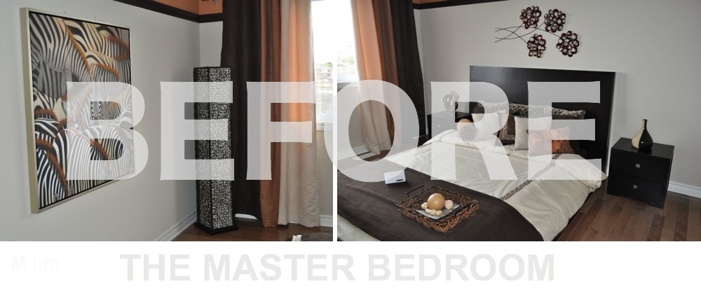
And we're back for part 2 of the model home redesign. Above is what the master bedroom looked like before. I had to reuse the furniture and as much art and accessories as possible, while changing the look of the new master bedroom. 

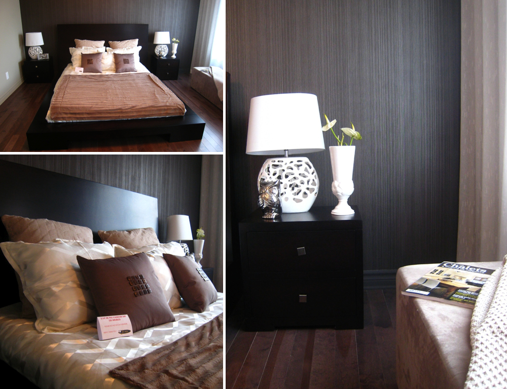
I went for a slightly different color palette and decided to install an accent wallpaper behind the bed as a focal point. You can see it being installed above by the master and his apprentice. After many considerations, I chose the Accents Decoline wallpaper DL30462 by Premier. I almost looked like fabric on the wall. 

To further soften the space, the window wall was covered with a sheer fabric installed by Ottawa Drapery. It gives a very neat effect. I was fortunate to find a new bed sheet set on sale from Winners  within budget and a couple accessories from Bouclair (accent pillows, lamps and owl) to top off some of the accessories that were in the previous model home (vase and photo frames).  


Facing the bed, I had enough space to reuse an existing table an bought a Louis Ghost chair imitation from Structube at a reasonable price. The lamp and wall mirrors are from Rona. I was looking for an original mirror for a the makeup table and the mirrored wall decals from from mur * mur fit the bill. ( I ended using a lot of their product throughout the house, so you'll see a few more decals for this project).  I like how the pieces of mirrors reflect the wall paper on the other side. 

The door next to the table, leads to the walk-in closet. I turned it into a mini jewelry box using a special paint from Rona called Metallic Accent. It's not an easy paint to apply on a wall. It took the painters a couple tries to get it right. I'm glad the general contractor used to specialize in faux finishes so he was able to show them how to apply the paint properly to get the full effect. With the special lighting fixture I added, everything inside shines and the reflection of the light on the wall is quite impressive. 


12.13.2012

MODEL HOME REDESIGN

I recently completed an interesting project for Junic, a prominent building developer in Gatineau. My mandate was to decorate the model suite of one of their new townhomes, using most of the furniture from the phase 1 model suite, while giving the new home a completely new feel. Challenge accepted!

Over the next couple posts, I'll be showing you the transformation and final result of this 1700 square foot home project, build to attract new buyers and make a lasting impression. As shown on the floor plan above, this two-storey home includes three bedrooms, two and a half bathroom, and a finished basement.

You can see above pictures from Phase 1, including some of the furniture I had to reuse like the sofa,  the table, the beds the night table, etc.  


Here's a sneak peak of my work. I dramatically changed the colors and went for a completely different theme. Paint is the easiest and least expensive way to transform a place. Add some clever accessories and you have a completely new space. This was important since the floor plan of both townhomes are very similar.  Over the new few posts, I'll be going over each room to show you what I've done, so stay tuned for more details soon. 


9.21.2009

Pink and Orange Room for a little girl

Some of my clients are great DIYers. For their projects, my work consists of coming up with a great design concept for them to execute. Even if I'm always available to guide them through, they make the final decision, so it's always a nice surprise to see the final results because inevitably they will add their own touch to the design. Here's an example from a couple who was redoing their little girl's room because she was finally ready to trade her crib for her first bed.

Originally the space was dark and not very feminine. The parents wanted a room that better suited her personality.
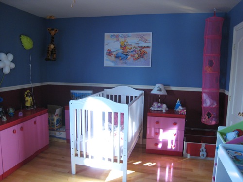
M2JL :: STUDIO bedroom makeover

Apart from the items that had to stay in the room (mostly the pink furniture), my color scheme came from this really cute stuffed giraffe that was in her room.

M2JL :: STUDIO bedroom makeover

As you can see, paint makes a huge difference in the look and feel of a room. For her room, I proposed to change the color of the walls to brighten the space, and go bold on the ceiling to add personality and warmth. The walls were painted white and the ceiling fuchsia. This solution gave a very nice pink glow to the room without having to paint the walls pink. I had to consider the fact that a lot of the existing pink furniture was staying in the room, so pink walls would have been too much.

M2JL :: STUDIO bedroom makeover

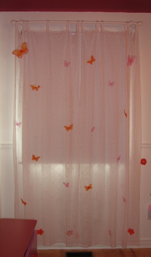
I also proposed to use a wall adhesive above the bed. I love the one they finally chose to put over the bed. I also love the customization of the curtains, where pink and orange butterflies were added on the sheer curtain. These clients really took the concept and ran with it. Apparently the little girl loves to stare at the ceiling. They did a great job.

M2JL :: STUDIO bedroom makeover

M2JL :: STUDIO bedroom makeover