Showing posts with label RESTAURANT. Show all posts

8.15.2012

BEIJING NOODLE No 9

M2JL STUDIO | Beijing Noodle No 9 - Las Vegas, Nevada
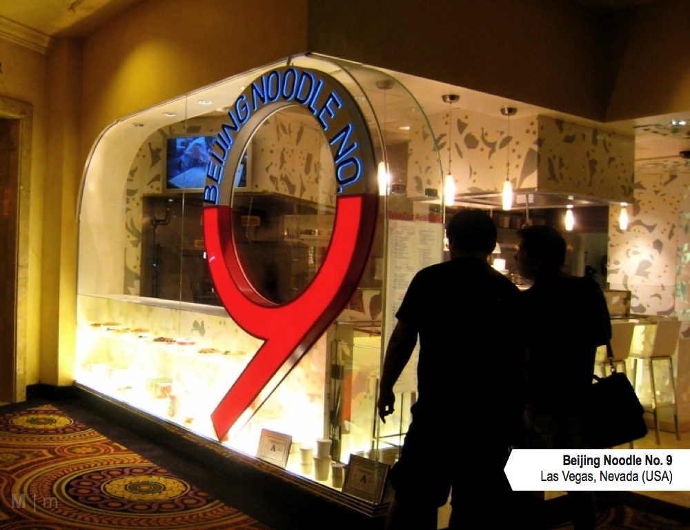
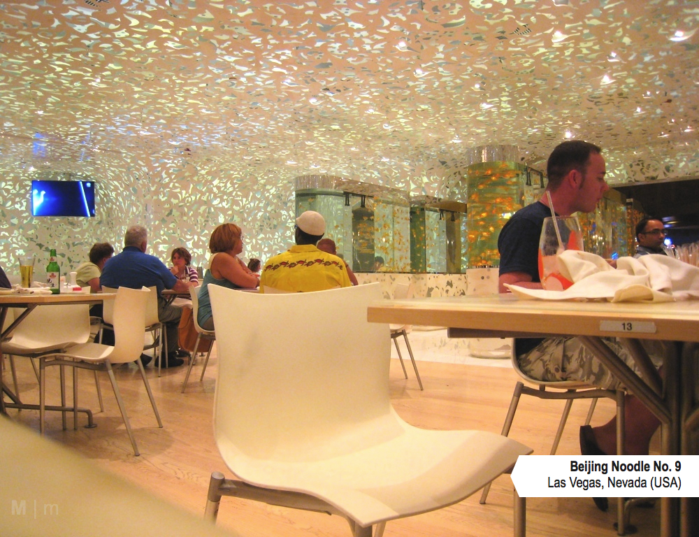
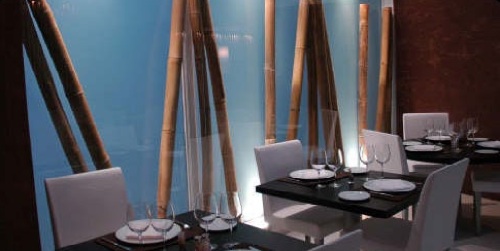
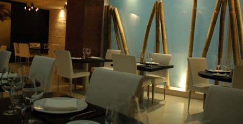
On a recent trip to Las Vegas, we went to eat at Beijing Noodle No 9, one of the many restaurants located in Cesars Palace. After seeing the restaurant's unique design on a TV show and hearing about their hand made and hand stretched noodles, I had to go see it for myself and try it out.

M2JL STUDIO | Beijing Noodle No 9 - Las Vegas, Nevada

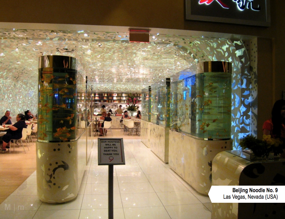
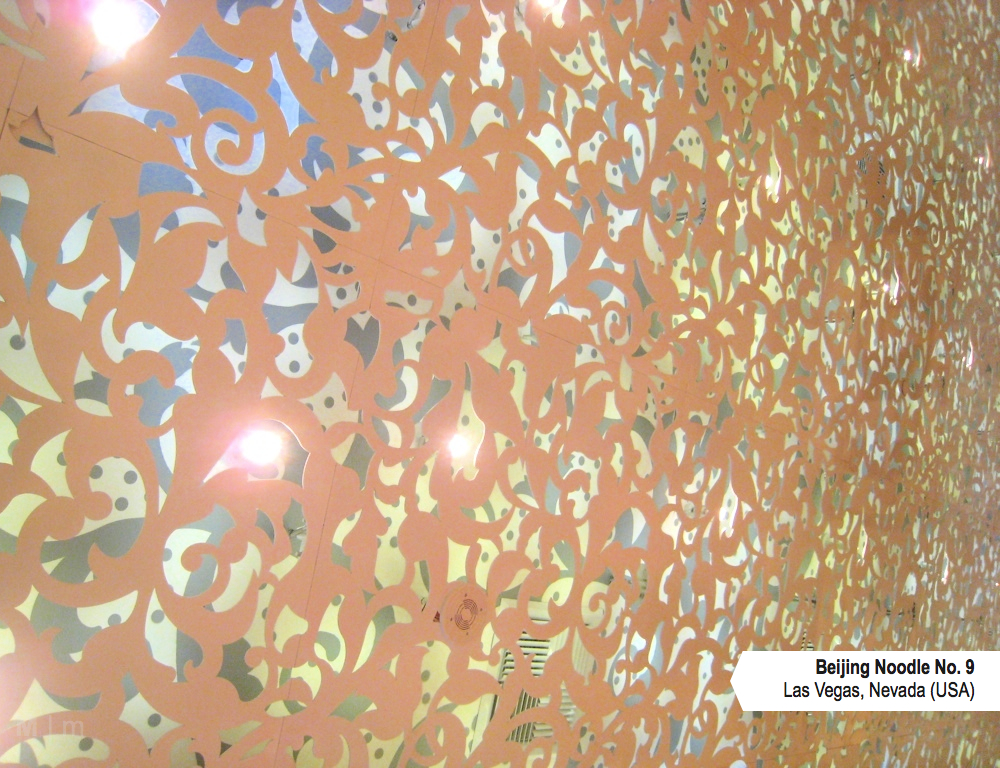
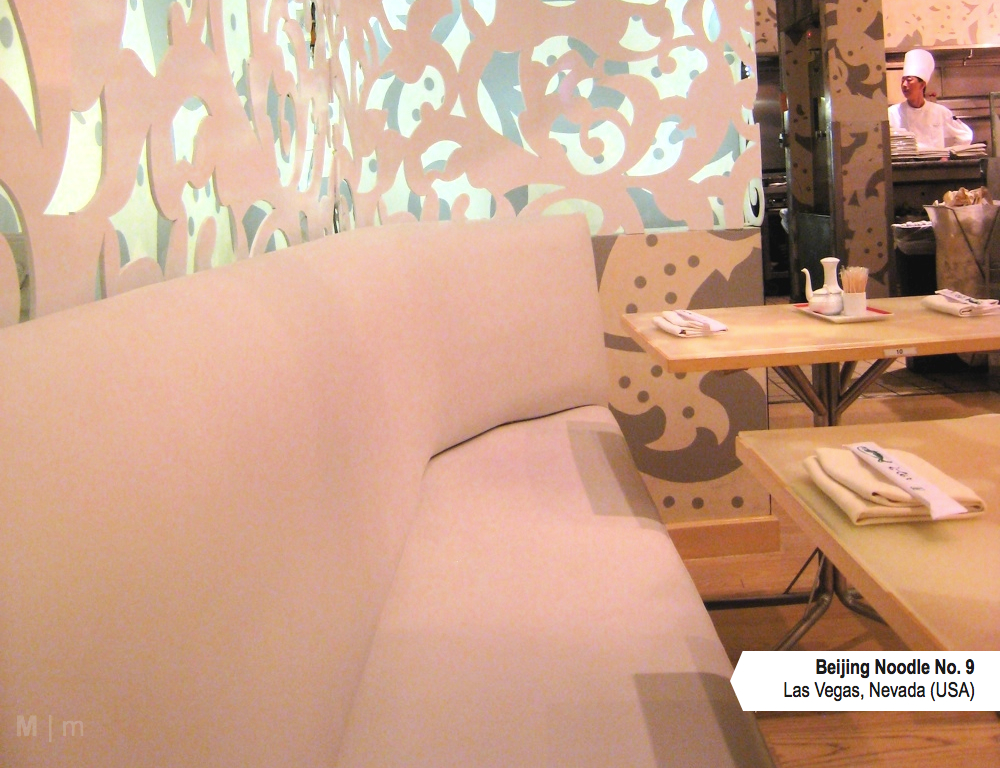
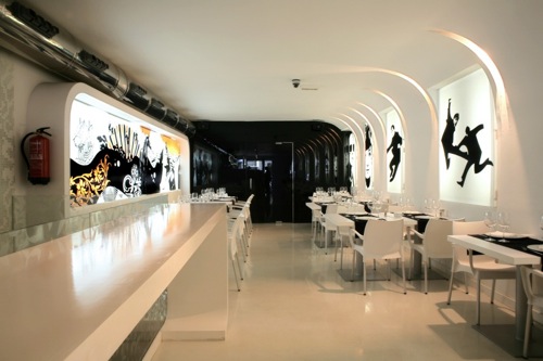
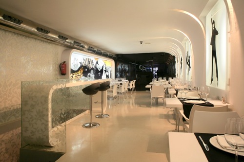
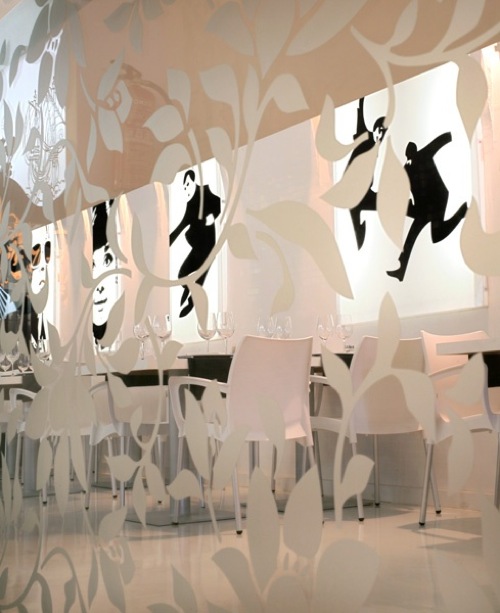
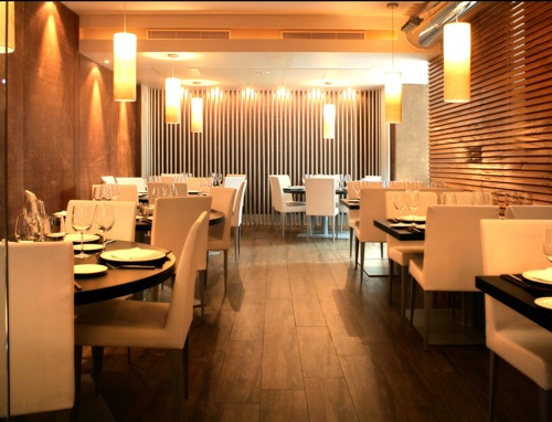
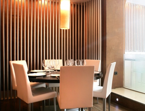
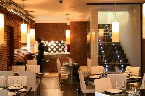
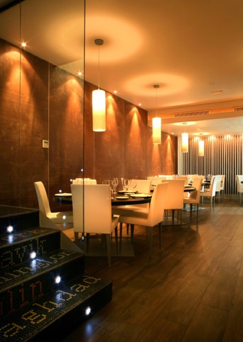
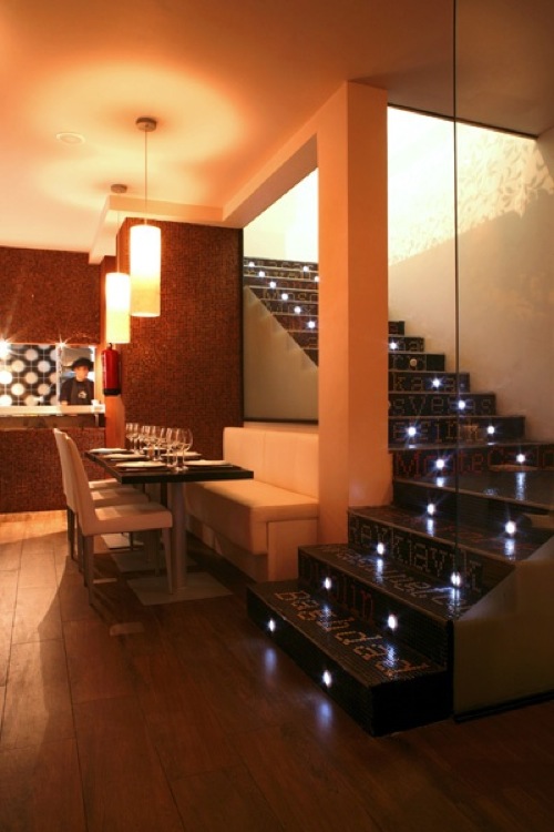
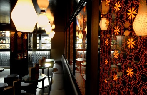
My first thought, when we finally found the place was "WOW". The entrance is flanked on two sides with giant fish tanks, where the swimming fish act like animated art on the "wall". Inside, the walls and ceiling are covered with what seems to be laser-cut steel sheets that gently curve at the junctions between the walls and the ceiling, giving them a seamless look. The pattern from the steel sheets gives a great amount of texture and dimension to the space, which is essentially monochrome but certainly not boring. 

M2JL STUDIO | Beijing Noodle No 9 - Las Vegas, Nevada

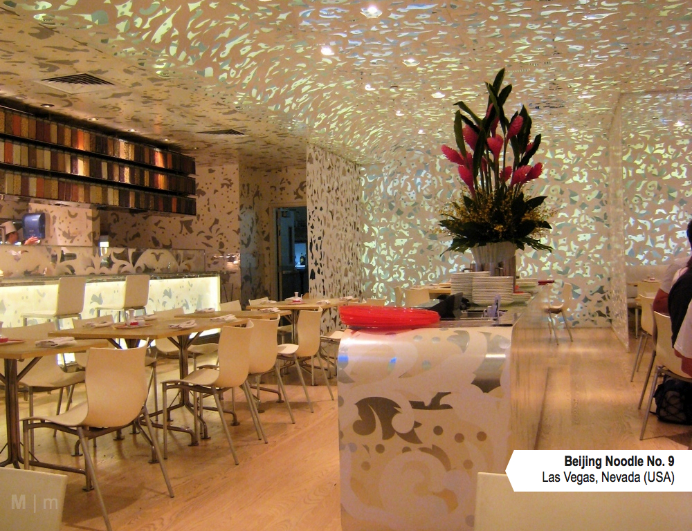
I love the attention to detail in this place. When you look up, you can see through the steel sheet that the ceiling above it has been covered with a covering similar to the pattern of the sheets, giving it another dimension, almost like shadows.

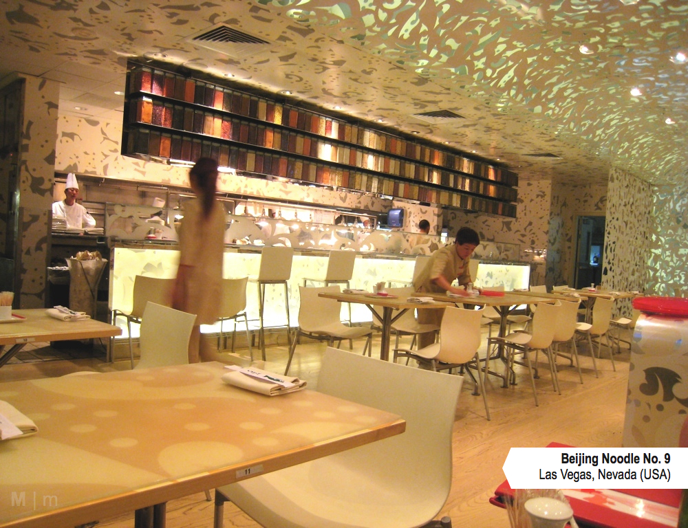
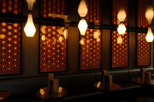
The ceiling is essentially a beautifully designed drop ceiling, hiding most vents and anything else that would alter the overall look of the space without compromising their function. It  would be great to see ideas like this integrated in commercial spaces such as offices and schools. It's so much better than the generic drop ceiling tiles we see everywhere here. 
M2JL STUDIO | Beijing Noodle No 9 - Las Vegas, Nevada

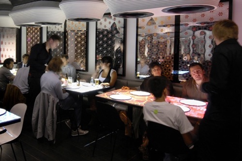
I'm not a big fan of the TV in this kind of place, but at least they are very thin. Perhaps in the future, there would be a way to project images directly on the wall surface instead. 
M2JL STUDIO | Beijing Noodle No 9 - Las Vegas, Nevada

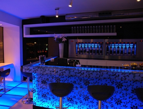
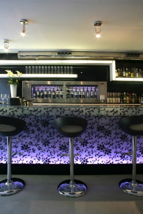
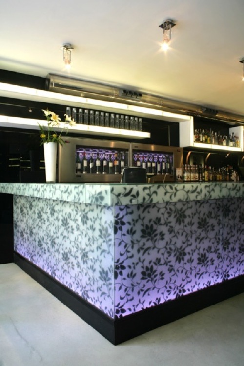
The main kitchen is partially opened, so you can sit at the bar and watch the cooks. The indirect lighting under the counter was a nice touch. This bold yet minimalist design is the work of a Japanese firm called design spirits. Not surprisingly, they won several awards for this project dating from 2009. 
M2JL STUDIO | Beijing Noodle No 9 - Las Vegas, Nevada


The food
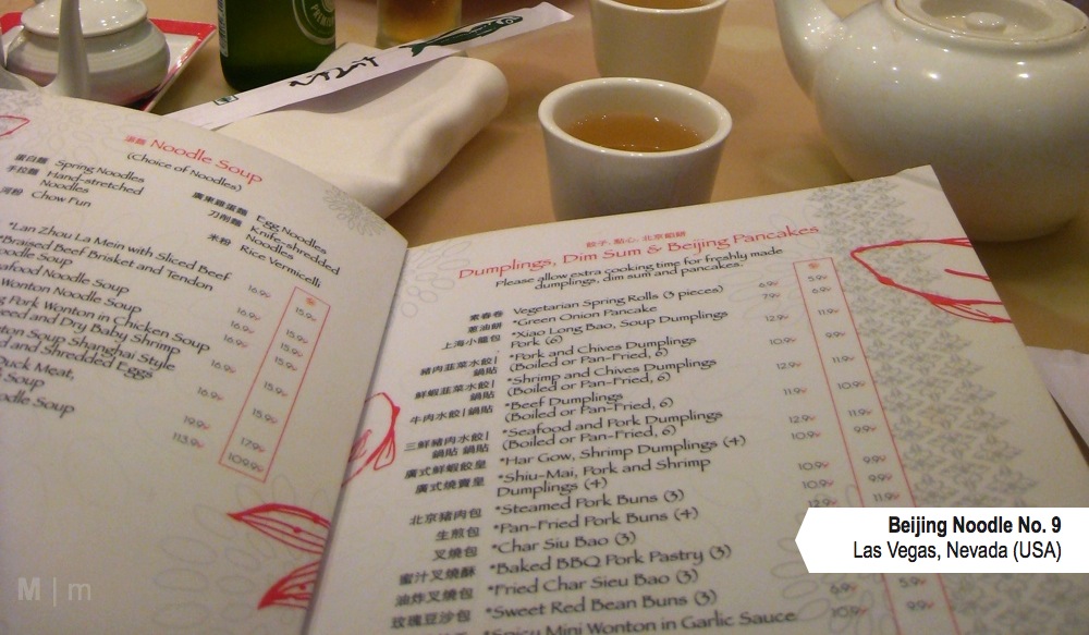
We tried the Lan Zhou La Mein with Sliced Beef, the War Wonton Noodle Soup and the BBQ pork buns. It was good. My favorite was the Wonton because the broth was light. Why was it called War Wonton? Because it was made with "shrimps fighting against pork", thus the word "war" in it. The beef soup was very flavorful but a little heavier than I expected. The pork buns were good, the "bread" tasked like regular white bread. I probably would have preferred steamed buns. Overall it was a great experience and  I would definitely go back to try a couple other dishes.  
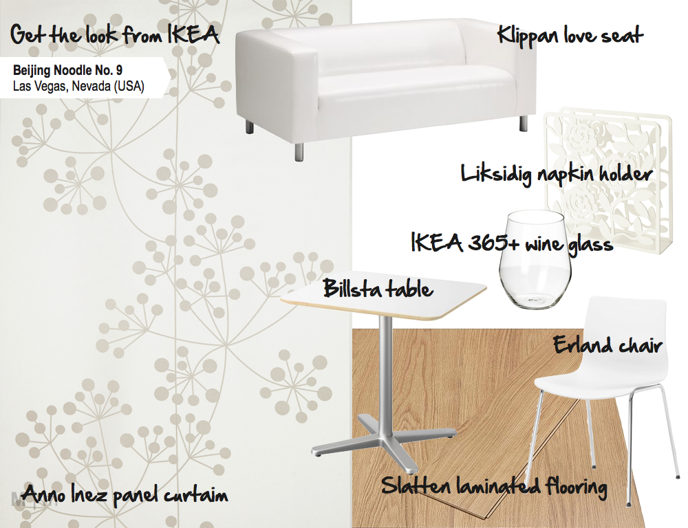
M2JL STUDIO | Beijing Noodle No 9 - Las Vegas, Nevada


Get the look
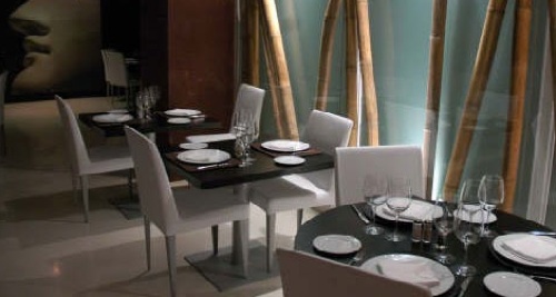
If you would like to have a similar look in own your home, you can do so by going to IKEA. I found a couple of pieces that would be perfect for it : Anno Inez panel, Klippan love seat, Liksidig napkin holder, Billsta table, IKEA 365+ wine glasses, Erland chair and Slatten laminate floor.

Also, if you're looking to purchase any items at IKEA, IKEA Canada is currently running a new  pinning contest from their new Pinterest account. Everyday until August 26, one person gets a chance to win a $100 gift certificate toward their favorite item simply by pinning them from IKEA's board. Check out their page for more info.

M2JL STUDIO | Beijing Noodle No 9 - Las Vegas, Nevada


7.21.2012

OLIVER & BONACHI CAFE GRILL

M2JL STUDIO | Oliver & Bonachi Café Grill Toronto, Canada
I recently went to eat at O&B in Toronto and was inspired by the many design features of the place, so I decided to take some pictures and share them with you. The style of the restaurant is an eclectic mix of country, industrial and contemporary decor. As you come in, the main focal point is the reception desk with a wall covered in bright white horizontal wood panels, adding texture behind the contrasting black logo. Adding the light on the sides and top, give the display even more impact. You can't miss it! Also,  notice how the designers cleverly used that wall to create an intimate and cozy booth behind the reception desk. The three suspended glass fixtures emphasize the focal point even more without hiding the logo.  

It's probably not from the designer, but I'm not too fond of the IKEA Kitchen cart in front of the desk. It takes away from the overall look. I think it would have been better to keep most of the books behind the counter, leaving only a couple at the time on the counter. I would also ditch the freestanding poster. 

M2JL STUDIO | Oliver & Bonachi Café Grill Toronto, Canada
Another interesting design solution is how the designers created different sections with the use of color and architectural features. On the left, the chairs are whites and the ceiling is a little lower. On the right (which really was the center of the room), the ceiling is a little higher and has purple panels. That section is also anchored by the wine bottle display in the back and the series of organic light fixtures above the booths. Notice also that the chairs in this section are black on one side of the table and the other side have booths, which create a separation from the other side. 

M2JL STUDIO | Oliver & Bonachi Café Grill Toronto, Canada
On the wall facing the bottle display wall are a series of enclosed booths, which is where we sat down. The same light fixtures used at the reception desk were used above each table. The wall were covered with metal ceiling panels. The design of the ceiling panels was emphasized with indirect lighting above and below them. This created a very nice mood.
 M2JL STUDIO | Oliver & Bonachi Café Grill Toronto, Canada
The food was good. I would give it 8/10. The B.C. Albacore tuna tataki  (left) was excellent and refreshing. The Japanese Chicken Ceasar Salad (centre) tasted really good, but the chicken was a little dry and the presentation could use a little help. The dessert (right) was excellent. It was an apple & wild blueberry crumble with Madagascar vanilla gelato. The candle and chocolate message (you can only see a little portion of it at the bottom) was a special add-on from our waitress.


visit our facebook page for the latest on M2JL STUDIO. 

9.07.2009

Who knew McDonalds could look so good

Not that I'm a huge fan of McDonalds, but I admire the fact that it is a company that's not afraid of changing, adapting, evolving and moving towards the future. Soon after the Supersize Me movie, it started to offer healthier alternatives and was the first to indicate the nutrition value of all their meals and some branches are now recycling as well. In Europe, interiors of the McDonald chains are moving to the modern side. Shh an architectural, design and branding company in the UK created three modern McDonalds restaurants in the UK : a flagship store on Oxford street, an outlet in the Chapelfield shopping center in Norwich and another one in West Thurrock.

Flagship Restaurant in Oxford
The flagship restaurant located on Oxford street includes a teenage 'bar' dining area, TV screens, internet and gaming points. It makes sense considering the fact that in an urban location, teenagers are more likely to go there. If only the one in the Byward Market (Ottawa) could look like this (*sigh*). There are beautiful glass stairs leading to the second floor. I love the way they integrated the colors of McDonalds (yellow and red) in a modern way. I imagine it's a nice hang out spot for teenagers if they don't over do it.

Modern McDonald designed by Shh

Modern McDonald designed by Shh

Modern McDonald designed by Shh

Modern McDonald designed by Shh

Modern McDonald designed by Shh


Norwich outlet
In Norwich, the design of the flagship restaurant was adapted for a mall. I think they did a really good job. Instead of the typical square counter they made it round and bright white so the red and yellow really stand out. I love the red tiled wall in behind the booth and the large white u-shaped counter. It looks like an ideal place for kids. The booths on the other side of the red glass panels are a bit off to me. I love their shape and the idea, but I don't get the color (a bit old compared to the rest of the space). Perhaps it has to do with the mall rather than the McDonalds.

Modern McDonald designed by Shh

Modern McDonald designed by Shh

Modern McDonald designed by Shh

Modern McDonald designed by Shh

Modern McDonald designed by Shh


West Thurrock outlet
For the West Thurrock restaurant, a freestanding drive-though restaurant, they went on a slightly different direction using accents of wood and a bit of orange (mixing the yellow and red from the brand's color... smart!). This space is a bit more serious. Apparently very popular with families, it includes an "optomusic pod", an interactive kids' game zone and internet stations. I love the pendant lights randomly placed above the seating area. Notice how the height of the booth increases at it gets closer to the area where people can order their food to give them more privacy (clever). The long red benches look like sofas, which make them inviting for groups. You can see why families would be inclined to come eat there. I love the lines they create in the space. Notice how even the shade of the chosen wood veneer match the McDonald colors: mixing the signature red and yellow to get that orange tint. The chairs use in this space evoke classic mid-century modern chairs such as the Ant Chair, Eames rocker.

Modern McDonald designed by Shh

Modern McDonald designed by Shh

Modern McDonald designed by Shh

Modern McDonald designed by Shh

Modern McDonald designed by Shh


I really hope fast food chains around here open up to modern design. Because what we get so far looks more like this :(

Typical McDonald Restaurant in Canada

Typical McDonald Restaurant in Canada


Modern design shouldn't only be for expensive restaurants. Right?

source: designdeinteriores, shh

8.21.2009

El Rancho, Alberto Aguilera


El Rancho Alberto Aguilera is a really neat restaurant in Madrid with multiple personalities. Designed by Miguel Garcia Caridad, this Argentinian grill is anything but traditional. It includes a bar, two dining areas, and a private room.


El City Bar
El City Bar, the bar, is a very bright and high energy space with bright white walls, large black and white images from the 60s and 70s. The curved ceiling, also a nod to the 60s, allows for a very nice effect with the light that curves from the ceiling onto the wall. Even the duct, in stainless steel, was considered in the design and the fire extinguisher looks like an accessory. I really like the black glass wall in the back too.

El Rancho Alberto Aguilera


The bar features a matte glass decorated with a floral pattern. Behind the glass are color changing LEDs. As the color of the lights changes, a new atmosphere is created in the space. A portion of the floor located in front of the window, also features color-changing LEDs, which probably gets the attention of any passerby. The white light shelves behind the bar were custom designed and provide a very nice contrast to the black wall.

El Rancho Alberto Aguilera


Salón Iroco
The design of the first dining room, Salon Iroco, has a calmer softer feel to it. There isn't a lot of contrast in this monochromatic space but there is a lot of texture: The horizontal wood strips on the wall to the right, the wood floor, the fabric on the wall to the left and the vertical tubes in the back, and the tiled wall near the kitchen.

El Rancho Alberto Aguilera


The stairs leading up to the bar are very interesting as well.They are covered with ceramic tiles in the shape of the name of various popular cities around the world. Two embedded lights in each riser emphasize this detail and create a nice effect.

El Rancho Alberto Aguilera


Salón Bambú
Salón Bambú, the second dining room, is very similar to Salón Iroco in design except that the wall features bamboo behind a glass with a blue backdrop. The feel is a bit less serious and a bit more contemporary.

El Rancho Alberto Aguilera


Salón Loft
Salón Loft is the private room. It's like the love child between El City Bar and Salón Iroco: a mix of classic and trendy. It has a high contrast, the walls are either covered with black back-stitched leather, classic style ceramic mosaic mural, featuring the face of a classic statue, or covered with painted white bricks. The black crystal chandeliers are also a mix of modern and classic. I can see a lot of common elements with the bar and the first dining room.

El Rancho Alberto Aguilera


There's another El Rancho, El Rancho Vincente Caledrón, also with multiple personalities when it comes to design, but completely different than El Rancho Alberto Aguilera, as shown here.

reference : Hosteleria, 2 trimestre 2009
photo: El Rancho Alberto Aguilera

2.15.2009

Surface computing has reached a restaurant

Inamo is a restaurant and bar unlike any other. Designed by Blacksheep interior architecture and design, it's a fusion of design and technology...my favorite :) I also love the black ceiling.

Located in Soho, London, it features an interactive ordering system where you can order your food on a surface computing system right on your table. This computer/table enables you to see what you can eat, the chefs cooking your food, choose the look of your table, find out about the neighborhood and more. I don't know if it's already in the interactive system, but I would add the option of drawing things and sending messages to other tables.

Inamo Restaurant
Inamo Restaurant
Inamo Restaurant
Inamo Restaurant
Photo: Blacksheep & Inamo


via : Trend Land