5.03.2013

new beginnings

As you may have noticed recently, the number of blog posts on M2JL STUDIO and Modern Ottawa has decreased significantly over the past few months. That’s because I’m starting a new chapter and embarking on a new and more creative adventure that involves drawing, painting, sketching and more. It’s something that I’ve been putting off for a long time but now it’s time for me to just make the jump, fully immerse myself in it and see where this takes me.

So in the light of this new beginning, I started a new blog...


I like to refer to it as my online creative lab. It’s a work in progress, but I like where it's going. You’ll find all kinds of drawings and sketchnotes on various topics, urban sketches from around town and from my travels as well as updates on our new puppy : Newton.  I hope you’ll join me and come along for this new ride:

NEW BLOG 

NEW TWITTER ACCOUNT 

NEW FACEBOOK PAGE

I also want to thank you for your time and your comments. It’s been fun and enlightening. I certainly learned a lot and I hope you did too. I look forward to bring what I learnt thus far to this new venture and make it even better.

Finally I’d like to leave you with this inspiring poster (source unknown), that describes what I intend to do. Hopefully it will also inspire you to do the same. :) 


1.19.2013

MODEL HOME REDESIGN - Part 6


We're now on the main floor of the Fusion project, in the powder room. The powder room is a place where you can be a little bold when it comes to decor, as it's a small and confined space that is somewhat separate from the rest. So I went for something a little more dramatic for this room while using the same basic color scheme. 


I didn't want to clutter this small space, so instead of adding art frames on the wall, I made the walls the art pieces. I found a really nice tile that reminded me of a waterfall when installed vertically and had them installed on the largest wall. I wanted to also add river rocks along of the walls, but because of the way some visitors let their kids loose in model home, it was too risky. The river rocks might have ended up in different parts of the house. So I opted for a neat wallpaper with a river rocks pattern to go behind the pedestal sink instead. 

There's not a lot of space to add decorative items in a space like this. So I didn't use a lot of accessories. Just two green plants to add a bit of color and life. 


1.17.2013

MODEL HOME REDESIGN - Part 5

For the second bedroom, I imagined the occupant would be a teenager (boy or girl) and decided to make this room a little more bold. As you can see I used the exact same furniture as in the previous model home, but completely changed the color scheme. I'm happy I was able to find another bedspread within budget, because it would have been harder to integrate the previous one in a new scheme. 
One major decor element was to have stripes painted on the wall and the ceiling. Not sure if the painters were too happy with this, but I love the impact it has as you enter the room. It gives it more energy. I also found a couple interesting accessories. I really like the table light with a glass base that I found on sale at Winners. It was perfect to for the little elephants I placed inside. 

On the other side,  I wanted to add something interesting and simple and decided to go with wall stickers from Blik of the Dancers illustrations by Keith Haring. They're fun and are perfect for a teen's room without being gender specific. 

1.15.2013

MODEL HOME REDESIGN - Part 4

One of the bedrooms had to be furnished as an office, so I decided to use the room next to the bathroom.  All the furniture, except for the two orange chairs were repurposed from previous model homes. 
It's interesting how things develop during the decorating stage of a project : it's part planning and part scavenger hunt and part luck. For the office, it started with the Solmyra frames from IKEA. I really liked them and I decided to add them to the decor during the planning phase. I figured they would have a great visual impact as they would be the first thing you see when you enter the room, on even when you just pass by. 

As I was looking for more accessories during the installation phase, I picked up the photo frame in the shape of a hand (on the desk) and found a the wall clock with the hand signs instead of numbers. As I look back at the room, it seems like I subconsciously found pieces that fit a "hand" theme for the room, which is appropriate for an office as it relates to working. 

I always think about how a person will use the space I design, and for me a home office needs a visible calendar. What better way to keep track of all your tasks and appointments than to always have them in your line of sign as you're working, without it cluttering your desk. So on the opposite wall, I created a monthly chalkboard calendar but cutting a large chalkboard wall sticker into squares. Next to it, I also added a weekly chalkboard calendar. This wall sticker was very difficult to install because of all the wholes in it (each letters and lines).  One was more then enough for me! 

1.13.2013

MODEL HOME REDESIGN - Part 3


Next to the master bedroom is the top floor bathroom. I was allowed to make a few modifications aside from the selection of colors and finishes from the available palette. So I decided to change the standard builder's mirror for two smaller and more interesting ones above each sink. I like how they contrast with the wall behind it.  

I learned a while ago that it's important to consider what the mirror reflects in your design and I always keep that in mind. I knew from the floor plan that there was going to be a large wall facing the mirror so I decided to have it covered with a mural. This particular one, called Dadelion, comes from Murale Unique.

When selecting the mural, I made sure it would pick up some of the colors from the room (e.g. the tile, the frame of  the mirror above the bath and the cabinets). Notice how the mural is also reflected above the tub, and again on the glass of the shower. Using reflection in your concept can help you make the most of your design elements. 

1.05.2013

MODEL HOME REDESIGN - Part 2

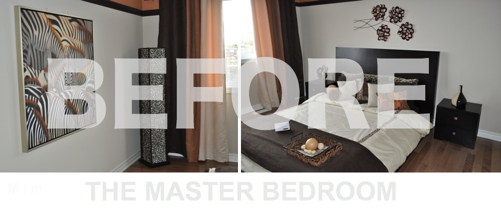
And we're back for part 2 of the model home redesign. Above is what the master bedroom looked like before. I had to reuse the furniture and as much art and accessories as possible, while changing the look of the new master bedroom. 

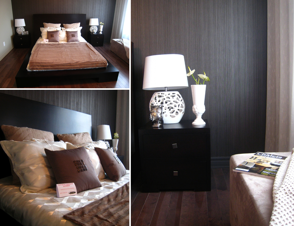
I went for a slightly different color palette and decided to install an accent wallpaper behind the bed as a focal point. You can see it being installed above by the master and his apprentice. After many considerations, I chose the Accents Decoline wallpaper DL30462 by Premier. I almost looked like fabric on the wall. 

To further soften the space, the window wall was covered with a sheer fabric installed by Ottawa Drapery. It gives a very neat effect. I was fortunate to find a new bed sheet set on sale from Winners  within budget and a couple accessories from Bouclair (accent pillows, lamps and owl) to top off some of the accessories that were in the previous model home (vase and photo frames).  


Facing the bed, I had enough space to reuse an existing table an bought a Louis Ghost chair imitation from Structube at a reasonable price. The lamp and wall mirrors are from Rona. I was looking for an original mirror for a the makeup table and the mirrored wall decals from from mur * mur fit the bill. ( I ended using a lot of their product throughout the house, so you'll see a few more decals for this project).  I like how the pieces of mirrors reflect the wall paper on the other side. 

The door next to the table, leads to the walk-in closet. I turned it into a mini jewelry box using a special paint from Rona called Metallic Accent. It's not an easy paint to apply on a wall. It took the painters a couple tries to get it right. I'm glad the general contractor used to specialize in faux finishes so he was able to show them how to apply the paint properly to get the full effect. With the special lighting fixture I added, everything inside shines and the reflection of the light on the wall is quite impressive. 


12.13.2012

MODEL HOME REDESIGN

I recently completed an interesting project for Junic, a prominent building developer in Gatineau. My mandate was to decorate the model suite of one of their new townhomes, using most of the furniture from the phase 1 model suite, while giving the new home a completely new feel. Challenge accepted!

Over the next couple posts, I'll be showing you the transformation and final result of this 1700 square foot home project, build to attract new buyers and make a lasting impression. As shown on the floor plan above, this two-storey home includes three bedrooms, two and a half bathroom, and a finished basement.

You can see above pictures from Phase 1, including some of the furniture I had to reuse like the sofa,  the table, the beds the night table, etc.  


Here's a sneak peak of my work. I dramatically changed the colors and went for a completely different theme. Paint is the easiest and least expensive way to transform a place. Add some clever accessories and you have a completely new space. This was important since the floor plan of both townhomes are very similar.  Over the new few posts, I'll be going over each room to show you what I've done, so stay tuned for more details soon. 


8.15.2012

BEIJING NOODLE No 9

M2JL STUDIO | Beijing Noodle No 9 - Las Vegas, Nevada
On a recent trip to Las Vegas, we went to eat at Beijing Noodle No 9, one of the many restaurants located in Cesars Palace. After seeing the restaurant's unique design on a TV show and hearing about their hand made and hand stretched noodles, I had to go see it for myself and try it out.

M2JL STUDIO | Beijing Noodle No 9 - Las Vegas, Nevada

My first thought, when we finally found the place was "WOW". The entrance is flanked on two sides with giant fish tanks, where the swimming fish act like animated art on the "wall". Inside, the walls and ceiling are covered with what seems to be laser-cut steel sheets that gently curve at the junctions between the walls and the ceiling, giving them a seamless look. The pattern from the steel sheets gives a great amount of texture and dimension to the space, which is essentially monochrome but certainly not boring. 

M2JL STUDIO | Beijing Noodle No 9 - Las Vegas, Nevada

I love the attention to detail in this place. When you look up, you can see through the steel sheet that the ceiling above it has been covered with a covering similar to the pattern of the sheets, giving it another dimension, almost like shadows.

The ceiling is essentially a beautifully designed drop ceiling, hiding most vents and anything else that would alter the overall look of the space without compromising their function. It  would be great to see ideas like this integrated in commercial spaces such as offices and schools. It's so much better than the generic drop ceiling tiles we see everywhere here. 
M2JL STUDIO | Beijing Noodle No 9 - Las Vegas, Nevada

I'm not a big fan of the TV in this kind of place, but at least they are very thin. Perhaps in the future, there would be a way to project images directly on the wall surface instead. 
M2JL STUDIO | Beijing Noodle No 9 - Las Vegas, Nevada

The main kitchen is partially opened, so you can sit at the bar and watch the cooks. The indirect lighting under the counter was a nice touch. This bold yet minimalist design is the work of a Japanese firm called design spirits. Not surprisingly, they won several awards for this project dating from 2009. 
M2JL STUDIO | Beijing Noodle No 9 - Las Vegas, Nevada


The food
We tried the Lan Zhou La Mein with Sliced Beef, the War Wonton Noodle Soup and the BBQ pork buns. It was good. My favorite was the Wonton because the broth was light. Why was it called War Wonton? Because it was made with "shrimps fighting against pork", thus the word "war" in it. The beef soup was very flavorful but a little heavier than I expected. The pork buns were good, the "bread" tasked like regular white bread. I probably would have preferred steamed buns. Overall it was a great experience and  I would definitely go back to try a couple other dishes.  
M2JL STUDIO | Beijing Noodle No 9 - Las Vegas, Nevada


Get the look
If you would like to have a similar look in own your home, you can do so by going to IKEA. I found a couple of pieces that would be perfect for it : Anno Inez panel, Klippan love seat, Liksidig napkin holder, Billsta table, IKEA 365+ wine glasses, Erland chair and Slatten laminate floor.

Also, if you're looking to purchase any items at IKEA, IKEA Canada is currently running a new  pinning contest from their new Pinterest account. Everyday until August 26, one person gets a chance to win a $100 gift certificate toward their favorite item simply by pinning them from IKEA's board. Check out their page for more info.

M2JL STUDIO | Beijing Noodle No 9 - Las Vegas, Nevada


7.21.2012

OLIVER & BONACHI CAFE GRILL

M2JL STUDIO | Oliver & Bonachi Café Grill Toronto, Canada
I recently went to eat at O&B in Toronto and was inspired by the many design features of the place, so I decided to take some pictures and share them with you. The style of the restaurant is an eclectic mix of country, industrial and contemporary decor. As you come in, the main focal point is the reception desk with a wall covered in bright white horizontal wood panels, adding texture behind the contrasting black logo. Adding the light on the sides and top, give the display even more impact. You can't miss it! Also,  notice how the designers cleverly used that wall to create an intimate and cozy booth behind the reception desk. The three suspended glass fixtures emphasize the focal point even more without hiding the logo.  

It's probably not from the designer, but I'm not too fond of the IKEA Kitchen cart in front of the desk. It takes away from the overall look. I think it would have been better to keep most of the books behind the counter, leaving only a couple at the time on the counter. I would also ditch the freestanding poster. 

M2JL STUDIO | Oliver & Bonachi Café Grill Toronto, Canada
Another interesting design solution is how the designers created different sections with the use of color and architectural features. On the left, the chairs are whites and the ceiling is a little lower. On the right (which really was the center of the room), the ceiling is a little higher and has purple panels. That section is also anchored by the wine bottle display in the back and the series of organic light fixtures above the booths. Notice also that the chairs in this section are black on one side of the table and the other side have booths, which create a separation from the other side. 

M2JL STUDIO | Oliver & Bonachi Café Grill Toronto, Canada
On the wall facing the bottle display wall are a series of enclosed booths, which is where we sat down. The same light fixtures used at the reception desk were used above each table. The wall were covered with metal ceiling panels. The design of the ceiling panels was emphasized with indirect lighting above and below them. This created a very nice mood.
 M2JL STUDIO | Oliver & Bonachi Café Grill Toronto, Canada
The food was good. I would give it 8/10. The B.C. Albacore tuna tataki  (left) was excellent and refreshing. The Japanese Chicken Ceasar Salad (centre) tasted really good, but the chicken was a little dry and the presentation could use a little help. The dessert (right) was excellent. It was an apple & wild blueberry crumble with Madagascar vanilla gelato. The candle and chocolate message (you can only see a little portion of it at the bottom) was a special add-on from our waitress.


visit our facebook page for the latest on M2JL STUDIO.